https://github.com/wpham1/assessment/
The purpose of my portfolio website is to show potential recruiters and other web developers a bit more about myself, my skills, projects I've worked on and how to get in contact with me. My target audience would be hiring managers or people who want collaborators on game projects.
I wanted to show that I love to collaborate on projects by having a projects page with game jams I've worked on, some things that I've been doing in my blog page (although they do have placeholder text) and a way to reach out to me on my contact page.
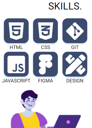
I designed my website with a minimalistic and bold design, utilising heavily weighted fonts and using little text for accessibility and ease of reading. I originally had different shades of blue for my icons and buttons, but referred to the 7:1 contrast method and changed the design to reflect that, making it read easier for poor sighted folk.
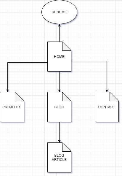
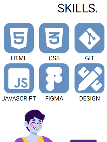
On my home page I have a little bit of information about myself, my skills represented by icons and some interactivity when you hover over the icons, and boxes you can click
I have a navbar on every page for easy navigation and my social media icons on the footer of every page so if I grab their interest on any of my pages they can explore further. I wanted big cards and buttons that stood out, so viewers would be invited to click on them.
I have auto-playing videos in my Projects page so that viewers are more engaged with my page and aren't bored looking at still images; by seeing the gameplay beforehand, viewers will want to explore further and potentially play the games that I've worked on. I've hyperlinked all the project titles to their respective game page for viewers to explore further and a button on the bottom of the page that links to a page with all the games.
For my blog, I wanted viewers to have the ability to read whichever article caught their eye first, from either the image, title or content tease. When the viewer picks an article to read, the image they saw from the blog list appears as the image banner in the article page for consistency and a feeling of continuity. I've added a "previous post" section underneath the article so viewers who enjoyed the post can continue reading my writing. For the last post that has no previous articles, I've replaced with a link back to the blog page so if readers have skipped any articles they can see any they have missed.
For the contact page, there is a simple contact form that viewers can enter their name, e-mail and message and press a send button that sends to the e-mail that I've linked to the page. I used formspree.io to set up my e-mails and can access and view who have e-mailed me through their service as well as straight to my e-mail app. I've included my e-mail again underneath, just in case they needed it otherwise as plus text saying that I'm "available now".
I used HTML for the foundation of my website and Sass to compile a CSS stylesheet to style the HTML; Visual Studio Code was used as my editor; Git was used as version management control through Git Bash; Trello was used for project management and Figma was used for wireframing mockups.
Looking through awwwards.com and googling Web Developer portfolios helped lead me in the direction I wanted to go with my portfolio. A lot of websites utilised Bootstrap/Javascript and made me realise how limited I was with what I could do using just HTML and CSS. It motivates me to continue learning so that I can create cool websites like those that I saw.
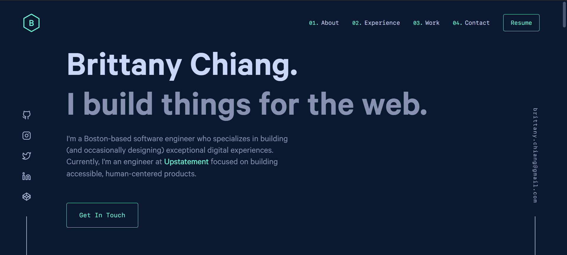
Brittany Chiang is a webdev whose design I really liked for its simple and clean design, yet extremely responsive. www.brittanychang.com is her website. I think she used bootstrap from inspecting her page, but still there was a lot I saw that I thought was achievable with my website.
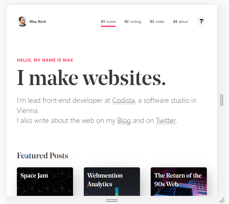
Max Böck's website had a very nice layout for his blog posts, and a very bold heading that I liked. I liked how the white/black combo despite being very simple was still impactful. Compared to the colour scheme that Brittany used, Max's colours feel like a newspaper article which I think he was going for with his posts and Brittany's remind me of a console terminal.
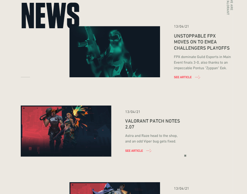
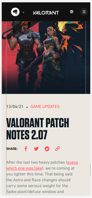
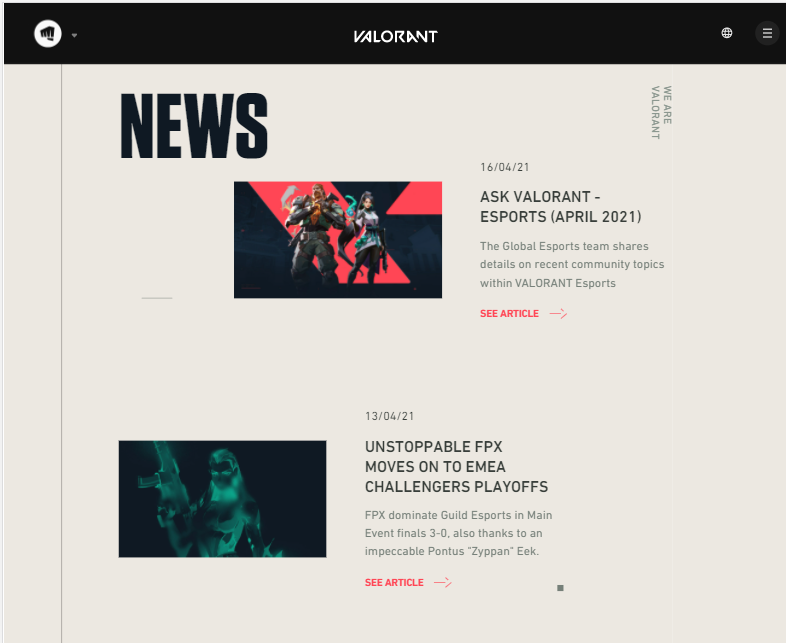
I was reading the Valorant (video game) patch notes when I realised that the patch notes were just blog posts and really liked the way they were laid out. I use a similar approach in my Blog page with the image banner continuity and share icon bar.
I tried to utilise the Trello board when I could (and when I remembered to), as I usually use other methods of keeping track of my work. I think as a developer project management tool it is very effective, especially in a team environment, so I will continue to use it in my future projects.

This was taken around the 14/15th April after I'd completed my phone wireframes and before starting my HTML documents.

More progress..

Complete!
I had a Polish Card, in case I had enough time to add some more features but unfortunately do not have the time to add them.

Here is a screenshot from when I first started building out my Home page. You can see that I have placeholder borders so that I know how each container interacts with the other.
My before and after contrast colour ratio check.
 Figma on the 13th April

Figma on the 14th April