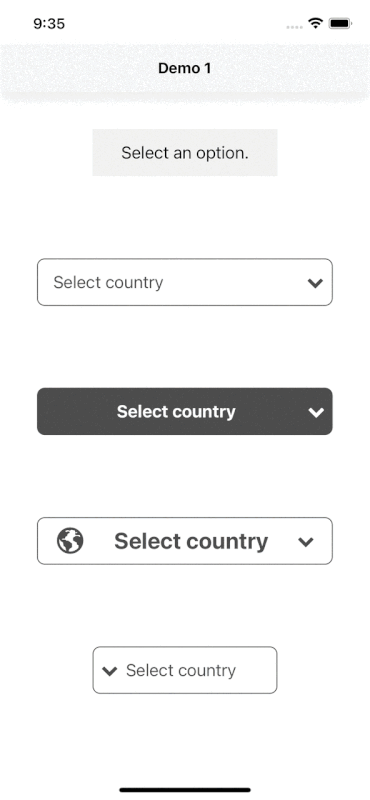
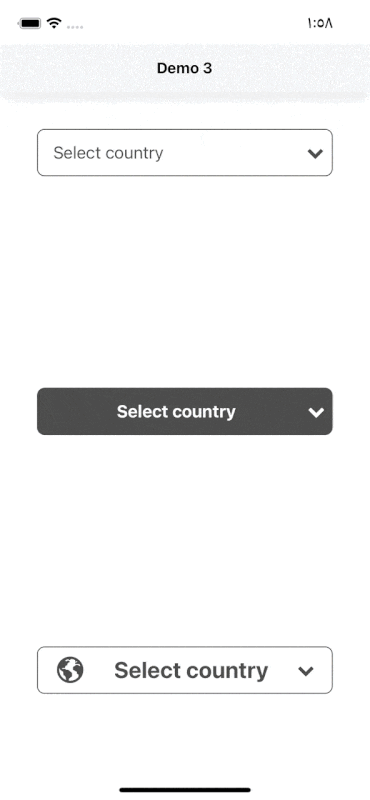
react-native-select-dropdown is a highly customized dropdown | select | picker | menu for react native that works for android and iOS platforms.
npm install react-native-select-dropdownyarn add react-native-select-dropdown

Install yarn add @shopify/flash-list then use <FlashSelectDropdown /> instead of <SelectDropdown /> for optimised benifits.
import SelectDropdown from 'react-native-select-dropdown'
...
const countries = ["Egypt", "Canada", "Australia", "Ireland"]
...
<SelectDropdown
	data={countries}
	onSelect={(selectedItem, index) => {
		console.log(selectedItem, index)
	}}
	buttonTextAfterSelection={(selectedItem, index) => {
		// text represented after item is selected
		// if data array is an array of objects then return selectedItem.property to render after item is selected
		return selectedItem
	}}
	rowTextForSelection={(item, index) => {
		// text represented for each item in dropdown
		// if data array is an array of objects then return item.property to represent item in dropdown
		return item
	}}
/>
const [data,setData]=useState()

<SelectDropdown
  multipleSelect
  search
  allowSelectAll
  searchPlaceHolder="Search Data"
  searchKey={["title"]}
  statusBarTranslucent={true}
  //defaultValue={defaulyValue}
  defaultValueByIndex={[1, 4, 5]}
  data={[{key:"demo",title:"This is your title 1"},{key:"demo2",title:"This is your title 2"}]}
  buttonStyle={{
    backgroundColor: "#cbd5e1",
    width: "100%",
  }}
  buttonTextStyle={{ fontSize: 14, textAlign: "left" }}
  dropdownStyle={{ marginTop: 0 }}
  selectedRowStyle={{ backgroundColor: "#e2e8f0" }}
  selectedRowTextStyle={{ fontWeight: "bold" }}
  rowTextStyle={{ fontSize: 14 }}
  defaultButtonText={"Select Here"}
  renderDropdownIcon={() => {
    return (
      <View>
        <AntDesign name="down" size={10} color="black" />
      </View>
    );
  }}
  onSelect={async (selectedItem,index) => {
    setData(selectedItem);
  }}
  buttonTextAfterSelection={"Selected"}
  rowTextForSelection={(item, index) => {
    return item.title;
  }}
/>;
array of data that will be represented in dropdown 'can be array of objects
| Type | Required |
|---|---|
| array | Yes |
function recieves selected item and its index in data array
if multipleSelect is true then recives array of items and arrat if selected index.
| Type | Required |
|---|---|
| function | Yes |
default button text when no item is selected
| Type | Required |
|---|---|
| String | No |
function recieves selected item and its index, this function should return a string that will be represented in button after item is selected
if multiple select is true then pass the string value
| Type | Required |
|---|---|
| function or string | Yes "unless you customized button using renderCustomizedButtonChild" |
function recieves item and index for each row in dropdown, this function shoud return a string that will be represented in each row in dropdown
| Type | Required |
|---|---|
| function | Yes "unless you customized button using renderCustomizedRowChild" |
default selected item in dropdown ( check examples in Demo1). If multiple select is true then pass the array of selected items.
| Type | Required |
|---|---|
| any | No |
default selected item index. If multipleSelect is true then pass the array of default indices.
| Type | Required |
|---|---|
| integer or array | No |
disable dropdown
| Type | Required |
|---|---|
| boolean | No |
disable auto scroll to selected value
| Type | Required |
|---|---|
| boolean | No |
disable choose all Rows index in the list
| Type | Required |
|---|---|
| array | No |
function fires when dropdown is opened
| Type | Required |
|---|---|
| function | No |
function fires when dropdown is closed
| Type | Required |
|---|---|
| function | No |
function fires when dropdown scrolls to the end (for paginations)
| Type | Required |
|---|---|
| function | No |
style object for button
| Type | Required |
|---|---|
| object | Yes |
style object for button text
| Type | Required |
|---|---|
| object | No |
function recieves selected item and its index, this function should return a React component as a child for dropdown button buttonStyle should be used for parent button view style.
| Type | Required |
|---|---|
| function | No |
function that should return a React component for dropdown icon
| Type | Required |
|---|---|
| function | No |
dropdown icon position "left" || "right"
| Type | Required |
|---|---|
| string | No |
required to set true when statusbar is translucent (android only)
| Type | Required |
|---|---|
| boolean | No |
style object for dropdown view
| Type | Required |
|---|---|
| object | No |
backdrop color when dropdown is opened
| Type | Required |
|---|---|
| string | No |
background color behind list items when dropdown is opened
| Type | Required |
|---|---|
| string | No |
style object for row
| Type | Required |
|---|---|
| object | Yes |
style object for row text
| Type | Required |
|---|---|
| object | No |
style object for selected row
| Type | Required |
|---|---|
| object | Yes |
style object for selected row text
| Type | Required |
|---|---|
| object | No |
style object for empty list
| Type | Required |
|---|---|
| object | No |
function recieves item and its index, this function should return React component as a child for customized row rowStyle should be used for parent row view style.
| Type | Required |
|---|---|
| function | No |
enable search functionality
| Type | Required |
|---|---|
| boolean | No |
style object for search input
| Type | Required |
|---|---|
| object | Yes |
text color for search input
| Type | Required |
|---|---|
| string | No |
placeholder text for search input
| Type | Required |
|---|---|
| string | No |
text color for search input placeholder
| Type | Required |
|---|---|
| string | No |
function returns React component for search input icon
| Type | Required |
|---|---|
| function | No |
function returns React component for search input icon
| Type | Required |
|---|---|
| function | No |
Drop Down Button Text number of lines (numberOfLines prop for Text)
| Type | Required | default |
|---|---|---|
| number | No | 1 |
Select Multiple values from the Drop down List
| Type | Required | default |
|---|---|---|
| boolean | No | false |
Searches only the specified keys if the data is object (by default searches all keys)
| Type | Required |
|---|---|
| array | No |
Allows user to select all data (works only if multiple select is true)
| Type | Required | default |
|---|---|---|
| boolean | No | false |
function callback when the search input text changes, this will automatically disable the dropdown's internal search to be implemented manually outside the component
| Type | Required |
|---|---|
| function | No |
| Method | Description |
|---|---|
reset() |
Remove selection & reset it to display defaultButtonText check AdelRedaa97#1 (comment). |
openDropdown() |
Open the dropdown. |
closeDropdown() |
Close the dropdown. |
selectIndex(index) |
Select a specific item by index. |