Event popup #11
There are no files selected for viewing
| Original file line number | Diff line number | Diff line change | ||||||||||||
|---|---|---|---|---|---|---|---|---|---|---|---|---|---|---|
| @@ -0,0 +1,84 @@ | ||||||||||||||
| import React from 'react' | ||||||||||||||
|
|
||||||||||||||
| import { useState } from 'react' | ||||||||||||||
| import styled from 'styled-components' | ||||||||||||||
| import SignUpButton from './SignUpButton' | ||||||||||||||
|
|
||||||||||||||
| const EventPopupContainer = styled.div` | ||||||||||||||
| position: absolute; | ||||||||||||||
| background-color: white; | ||||||||||||||
| padding: 20px; | ||||||||||||||
| margin-top: 100px; | ||||||||||||||
| margin-left: 20%; | ||||||||||||||
| margin-right: 20%; | ||||||||||||||
|
Contributor
There was a problem hiding this comment. these can be all expressed in one line i.e. |
||||||||||||||
| ` | ||||||||||||||
|
|
||||||||||||||
| const CloseButton = styled.button` | ||||||||||||||
| border-radius: 50%; | ||||||||||||||
| display: flex; | ||||||||||||||
| margin-left: auto; | ||||||||||||||
| background-color: #595959; | ||||||||||||||
| color: white; | ||||||||||||||
| font-weight: 600; | ||||||||||||||
| &:hover { | ||||||||||||||
| cursor: pointer; | ||||||||||||||
| } | ||||||||||||||
| ` | ||||||||||||||
|
|
||||||||||||||
| const PopupImage = styled.img` | ||||||||||||||
|
Contributor
There was a problem hiding this comment. use Next.js |
||||||||||||||
| display: block; | ||||||||||||||
| border-radius: 10px; | ||||||||||||||
| max-height: 70%; | ||||||||||||||
| max-width: 70%; | ||||||||||||||
| margin: 0 auto; | ||||||||||||||
| padding-top: 30px; | ||||||||||||||
| padding-bottom: 50px; | ||||||||||||||
|
Contributor
There was a problem hiding this comment. same, use CSS shorthand |
||||||||||||||
| ` | ||||||||||||||
|
|
||||||||||||||
| const PopupTitle = styled.h1` | ||||||||||||||
| display: flex; | ||||||||||||||
| font-size: 24px; | ||||||||||||||
| font-weight: 600; | ||||||||||||||
| color: black; | ||||||||||||||
| ` | ||||||||||||||
| const PopupContent = styled.p` | ||||||||||||||
| white-space: pre-line; | ||||||||||||||
| ` | ||||||||||||||
|
|
||||||||||||||
| type Props = { | ||||||||||||||
| image: any | ||||||||||||||
|
There was a problem hiding this comment. Avoid the use of the type
Contributor
There was a problem hiding this comment.
Suggested change
yeap, since it's a URL, it's a string. Try to avoid using There was a problem hiding this comment. Avoid using the |
||||||||||||||
| title: string | ||||||||||||||
| content: string | ||||||||||||||
| isActive: boolean | ||||||||||||||
| } | ||||||||||||||
|
|
||||||||||||||
| const defaultProps = { | ||||||||||||||
| image: | ||||||||||||||
| 'https://images.unsplash.com/photo-1481349518771-20055b2a7b24?ixlib=rb-4.0.3&ixid=MnwxMjA3fDB8MHxzZWFyY2h8NHx8cmFuZG9tfGVufDB8fDB8fA%3D%3D&w=1000&q=80', | ||||||||||||||
| title: 'Valentines Day Event', | ||||||||||||||
| content: | ||||||||||||||
| "Still thinking of what to get your friends or that special someone for VALENTINES DAY? RVC SP got you!!! With a wide assortment of gifts from fresh flowers and preserved flowers , there's bound to be something for everyone! As all stocks are limited, fill up the pre order form HERE to get FIRST DIBS on your items! P.S. Due to unforeseen circumstances, our crochet flowers will not be sold anymore but fret not! The other options are still available so faster PREORDER NOWWWWAll profits will be channelled to support the welfare of our beneficiaries so DONT WAIT ANYMORE!!! Show your love to your friends/ boo and do a good deed today!", | ||||||||||||||
| isActive: true, | ||||||||||||||
| } | ||||||||||||||
|
Contributor
There was a problem hiding this comment. rmb to remove these ya |
||||||||||||||
|
|
||||||||||||||
| function EventPopup(props: Props) { | ||||||||||||||
| const [isActive, setIsActive] = useState(true) | ||||||||||||||
| const closePopup = () => { | ||||||||||||||
| setIsActive(false) | ||||||||||||||
| } | ||||||||||||||
|
|
||||||||||||||
| return ( | ||||||||||||||
| <div> | ||||||||||||||
| {isActive && ( | ||||||||||||||
| <EventPopupContainer> | ||||||||||||||
| <CloseButton onClick={closePopup}>x</CloseButton> | ||||||||||||||
| <PopupImage src={defaultProps.image} alt="Event Image" /> | ||||||||||||||
|
There was a problem hiding this comment. Consider removing the use of the |
||||||||||||||
| <PopupTitle>{defaultProps.title}</PopupTitle> | ||||||||||||||
| <PopupContent>{defaultProps.content}</PopupContent> | ||||||||||||||
|
There was a problem hiding this comment. Should it be
Suggested change
Author
There was a problem hiding this comment. yea I'm just using this as a placeholder for testing haha since I think they haven't confirmed the details of how the information will be passed |
||||||||||||||
| <SignUpButton /> | ||||||||||||||
| </EventPopupContainer> | ||||||||||||||
| )} | ||||||||||||||
| </div> | ||||||||||||||
| ) | ||||||||||||||
| } | ||||||||||||||
|
|
||||||||||||||
| export default EventPopup | ||||||||||||||


| Original file line number | Diff line number | Diff line change | ||||||||
|---|---|---|---|---|---|---|---|---|---|---|
| @@ -0,0 +1,24 @@ | ||||||||||
| import React from 'react' | ||||||||||
|
There was a problem hiding this comment. Can you try removing this line and see if it works?
Contributor
There was a problem hiding this comment.
Suggested change
|
||||||||||
| import styled from 'styled-components' | ||||||||||
|
|
||||||||||
| const SignUpButtonContainer = styled.button` | ||||||||||
|
There was a problem hiding this comment. Perhaps this component can be better renamed as a button as it seems to fulfil the functions of a button?
Suggested change
Author
There was a problem hiding this comment. hmm it conflicts with the function name if I name it as SignUpButton, is there any way around this?
Contributor
There was a problem hiding this comment.
Suggested change
Name it like this instead. Also, there's no need to make an exclusive button just for signups. Instead make a generic button component that can be customised (i.e. take in params that set its display text, onClick function etc.)
Contributor
There was a problem hiding this comment.
mb for not mentioning earlier during the meeting, but i've placed some codes in the |
||||||||||
| display: flex; | ||||||||||
| background-color: #d9d9d9; | ||||||||||
| color: black; | ||||||||||
| font-weight: 600; | ||||||||||
| padding: 10px; | ||||||||||
| border-width: 0px; | ||||||||||
| margin-top: 50px; | ||||||||||
| margin-left: auto; | ||||||||||
|
|
||||||||||
| &:hover { | ||||||||||
| cursor: pointer; | ||||||||||
| border: 1px solid black; | ||||||||||
| background-color: white; | ||||||||||
| } | ||||||||||
| ` | ||||||||||
|
|
||||||||||
| function SignUpButton() { | ||||||||||
| return <SignUpButtonContainer>Sign Up Here!</SignUpButtonContainer> | ||||||||||
| } | ||||||||||
|
|
||||||||||
| export default SignUpButton | ||||||||||
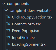
There was a problem hiding this comment.
Choose a reason for hiding this comment
The reason will be displayed to describe this comment to others. Learn more.
Can you try removing this line and see if it works?
There was a problem hiding this comment.
Choose a reason for hiding this comment
The reason will be displayed to describe this comment to others. Learn more.
old habits die hard; there is now no need to write this default import on every page in Next.js now (unless you're explicitely using the
Reactobject)