Releases: mobify/ui-kit
UI Kit v3.2
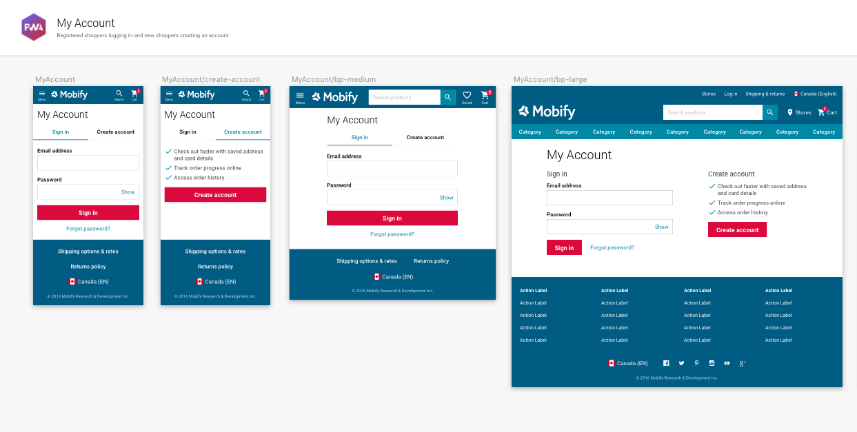
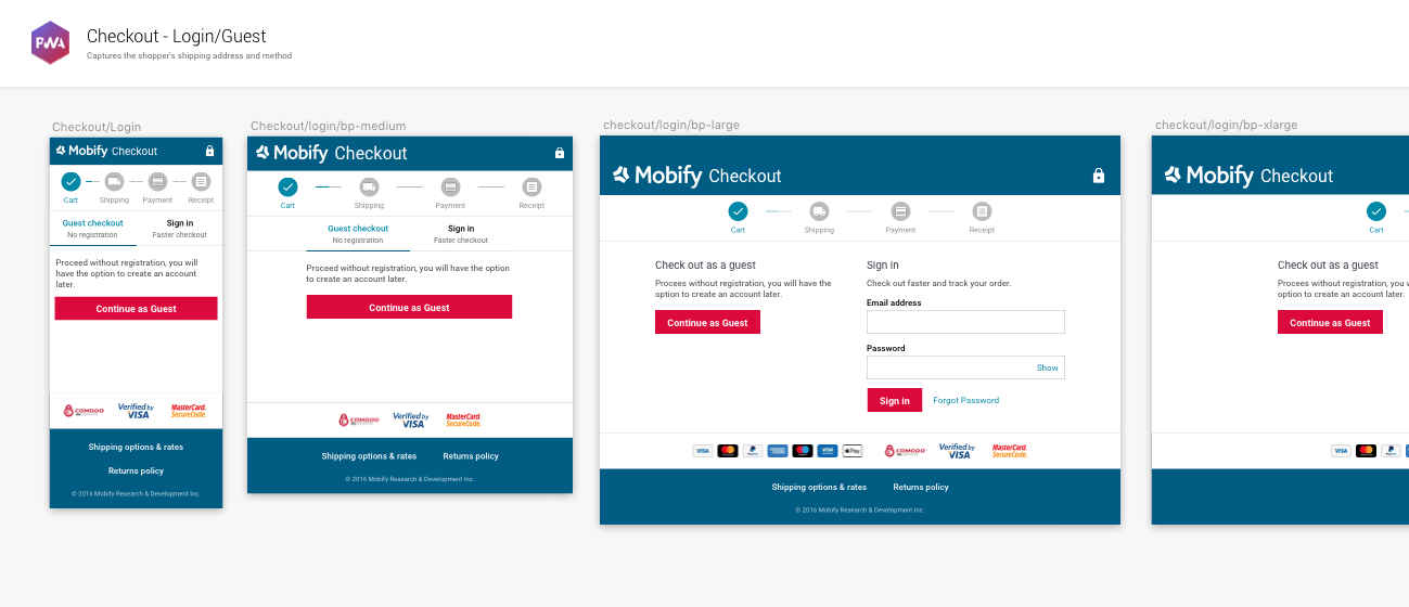
Responsive Checkout & My Account
This UI Kit release (version 3.2) is a part of Mobify’s 'November Rain' product release. It aligns with the Progressive Web SDK: version 1.6.0. Download the UI Kit on its own by using the Download link, or download the source files and kit requirements from this repo’s master branch.
What’s New in v3.2?
- My Account Layouts … New artboards added show our best practice responsive my account pages from the login and create account steps to the account dashboard.
- Checkout login … We've added a login screen to our checkout best practices to aid brands wishing to include this step in their customer's checkout design.
- Better organized layouts … Rather than having responsive layouts on their own artboards, we're keeping everything together under one template heading.
Was New In v3.1
- Responsive Cart … New artboards added show our best practice responsive shopping cart, based on industry research and learnings from our commerce customers.

- Responsive Checkout … New artboards added show our best practice responsive checkout flow from shipping to confirmation, based on industry research and learnings from our commerce customers.

- One single setup page … We've simplified the setup process by combining colors and type setup into one page. Applying your design system to the UI Kit can now be done in one place.

Need Help?
If you encounter a bug, get stuck on using the kit, or want to see something new added, please open up an issue in the parent GitHub repo, or open up a pull request so that we can have a discussion!
Happy building! ❤️
UI Kit v3.1
Responsive Checkout Screens
This UI Kit release (version 3.1) is a part of Mobify’s 'November Rain' product release. It aligns with the Progressive Web SDK: version 1.5.0. Download the UI Kit on its own by using the Download link, or download the source files and kit requirements from this repo’s master branch.
What’s New in v3.1?
- Responsive Cart … New artboards added show our best practice responsive shopping cart, based on industry research and learnings from our commerce customers.
- Responsive Checkout … New artboards added show our best practice responsive checkout flow from shipping to confirmation, based on industry research and learnings from our commerce customers.
- One single setup page … We've simplified the setup process by combining colors and type setup into one page. Applying your design system to the UI Kit can now be done in one place.
Was New In v3.0
-
Responsive Components … We've added a new artboard to the Components page that contains responsive variations of the Header, Footer and Navigation patterns.
-
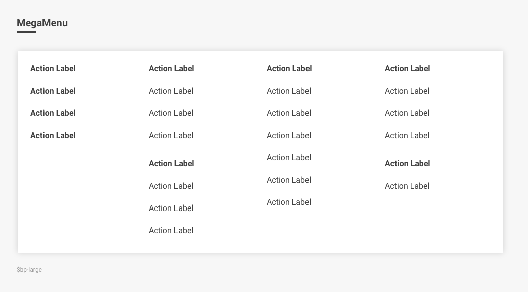
MegaMenu … To back up the release of our new responsive navigation component MegaMenu, you'll find an example of it on the Responsive Components artboard to use in your next UPWA design.
-
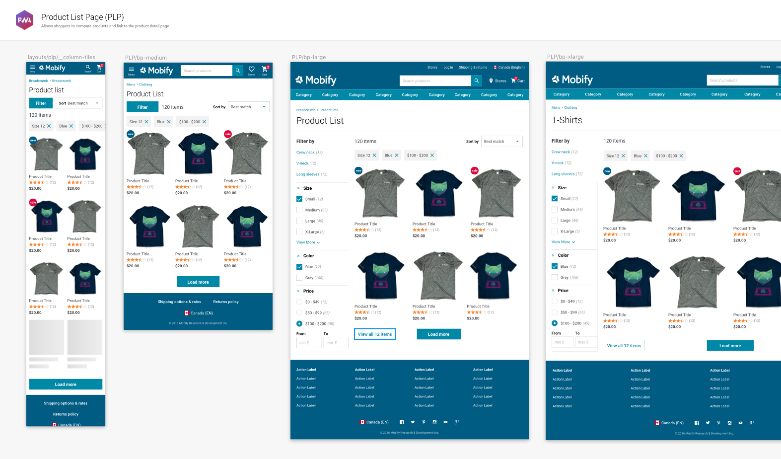
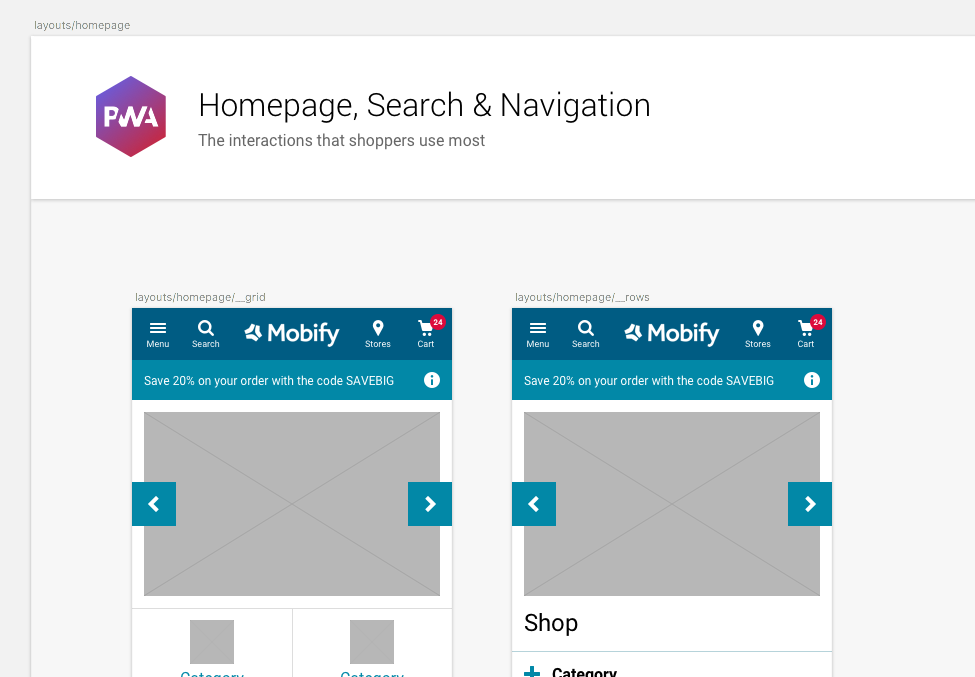
Responsive Layouts ... In the Best Practice Layouts page you will now see design examples of how the homepage, search, navigation, PLP and PDP scale up responsively.
-
Grid & Breakpoints ... To compliment the SDK's new Grid component, the UI Kit's responsive components and layouts use a 4 breakpoint system - Small (0-599px) Medium (600px) Large (960px) and Xlarge (1280+px). This grid system is how the responsive Homepage, PLP and PDP are set up in the UPWA developer starting point.
-
Easier way to define colors and typography ... We've adjusted the layout of the setup pages to make it easier to apply a brand's digital style guide.
Need Help?
If you encounter a bug, get stuck on using the kit, or want to see something new added, please open up an issue in the parent GitHub repo, or open up a pull request so that we can have a discussion!
Happy building! ❤️
UI Kit v3.0
Universal PWAs!
This UI Kit release (version 3.0) is a part of Mobify’s September product release. It aligns with the Progressive Web SDK: version 1.4.0. Download the UI Kit on its own by using the Download link, or download the source files and kit requirements from this repo’s master branch.
What’s New in v3.0?
- Responsive Components … We've added a new artboard to the Components page that contains responsive variations of the Header, Footer and Navigation patterns.

- MegaMenu … To back up the release of our new responsive navigation component MegaMenu, you'll find an example of it on the Responsive Components artboard to use in your next UPWA design.
- Responsive Layouts ... In the Best Practice Layouts page you will now see design examples of how the homepage, search, navigation, PLP and PDP scale up responsively.

-
Grid & Breakpoints ... To compliment the SDK's new Grid component, the UI Kit's responsive components and layouts use a 4 breakpoint system - Small (0-599px) Medium (600px) Large (960px) and Xlarge (1280+px). This grid system is how the responsive Homepage, PLP and PDP are set up in the UPWA developer starting point.
-
Easier way to define colors and typography ... We've adjusted the layout of the setup pages to make it easier to apply a brand's digital style guide.

Was New In v2.6.0
-
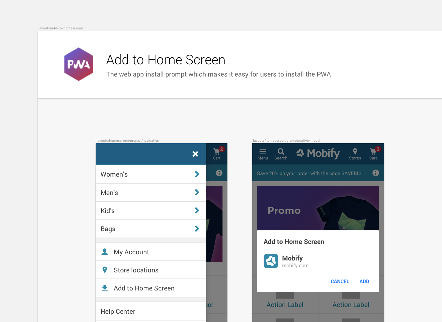
Add to Home Screen ➡️ Full Screen Mode … We've renamed the Add to Home Screen pattern to Full Screen Mode since the screens show how the user can launch the PWA in the same way they might launch an app, as a focused experience without the browser bar (FullScreenMode).
-
Add to Home Screen - a new way to prompt the user … In Chrome 68 and later, we can use a custom prompt to show the official modal for the Add to Home Screen feature. This allows us to prompt the user within the app itself, instead of relying on the browser's built-in prompts.
-
Accounting for edge cases on Add to Home Screen … The Chrome browser can only display the official modal for Add to Home Screen once per session. If the user clicks Cancel in the official modal, we can replace our custom prompt in the menu drawer with a message that asks the user to refresh the page and try again.
-
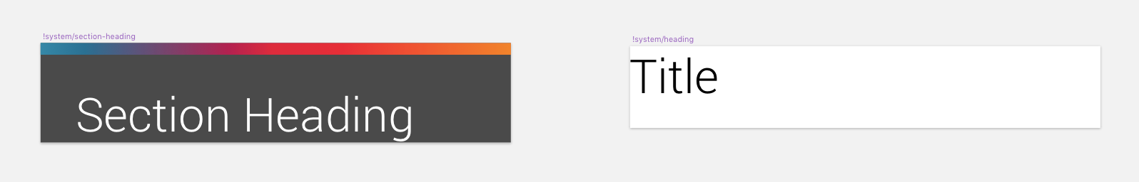
Updating duplicate symbol headings … There was a small instance where two symbols had the same name. We've renamed one to !system/section-heading and the other to !system/heading
-
Relinking HeaderBar symbol to its color palette … Some instances of HeaderBar linked to unused libraries 🤔 We've now cleaned that up so all instances of HeaderBar will update if the background color is changed.
Need Help?
If you encounter a bug, get stuck on using the kit, or want to see something new added, please open up an issue in the parent GitHub repo, or open up a pull request so that we can have a discussion!
Happy building! ❤️
UI Kit v2.6.0
A new and improved Add to Home Screen + bug fixes 🌴
This UI Kit release (version 2.6.0) is a part of Mobify’s August product release. It aligns with the Progressive Web SDK: version 1.4.0. Download the UI Kit on its own by using the Download link, or download the source files and kit requirements from this repo’s master branch.
What’s New in v2.6.0?
- Add to Home Screen ➡️ Full Screen Mode … We've renamed the Add to Home Screen pattern to Full Screen Mode since the screens show how the user can launch the PWA in the same way they might launch an app, as a focused experience without the browser bar (FullScreenMode).

- Add to Home Screen - a new way to prompt the user … In Chrome 68 and later, we can use a custom prompt to show the official modal for the Add to Home Screen feature. This allows us to prompt the user within the app itself, instead of relying on the browser's built-in prompts.
- Accounting for edge cases on Add to Home Screen … The Chrome browser can only display the official modal for Add to Home Screen once per session. If the user clicks Cancel in the official modal, we can replace our custom prompt in the menu drawer with a message that asks the user to refresh the page and try again.

- Updating duplicate symbol headings … There was a small instance where two symbols had the same name. We've renamed one to !system/section-heading and the other to !system/heading
- Relinking HeaderBar symbol to its color palette … Some instances of HeaderBar linked to unused libraries 🤔 We've now cleaned that up so all instances of HeaderBar will update if the background color is changed.

Was New In v2.5.0
-
Updates to existing InlineAsk component … We've updated our best practice subscription flow to be GPR compliant. Ensuring there is space to offer more explanatory text and links to further information.
-
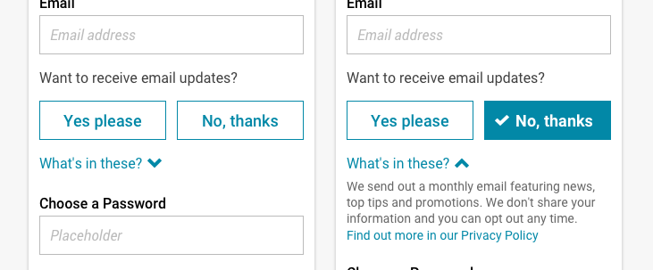
A more effective way for users to opt in … We've added some new patterns to support opt in flows. Instead of using check boxes, use buttons to present the user with a clear choice.
-
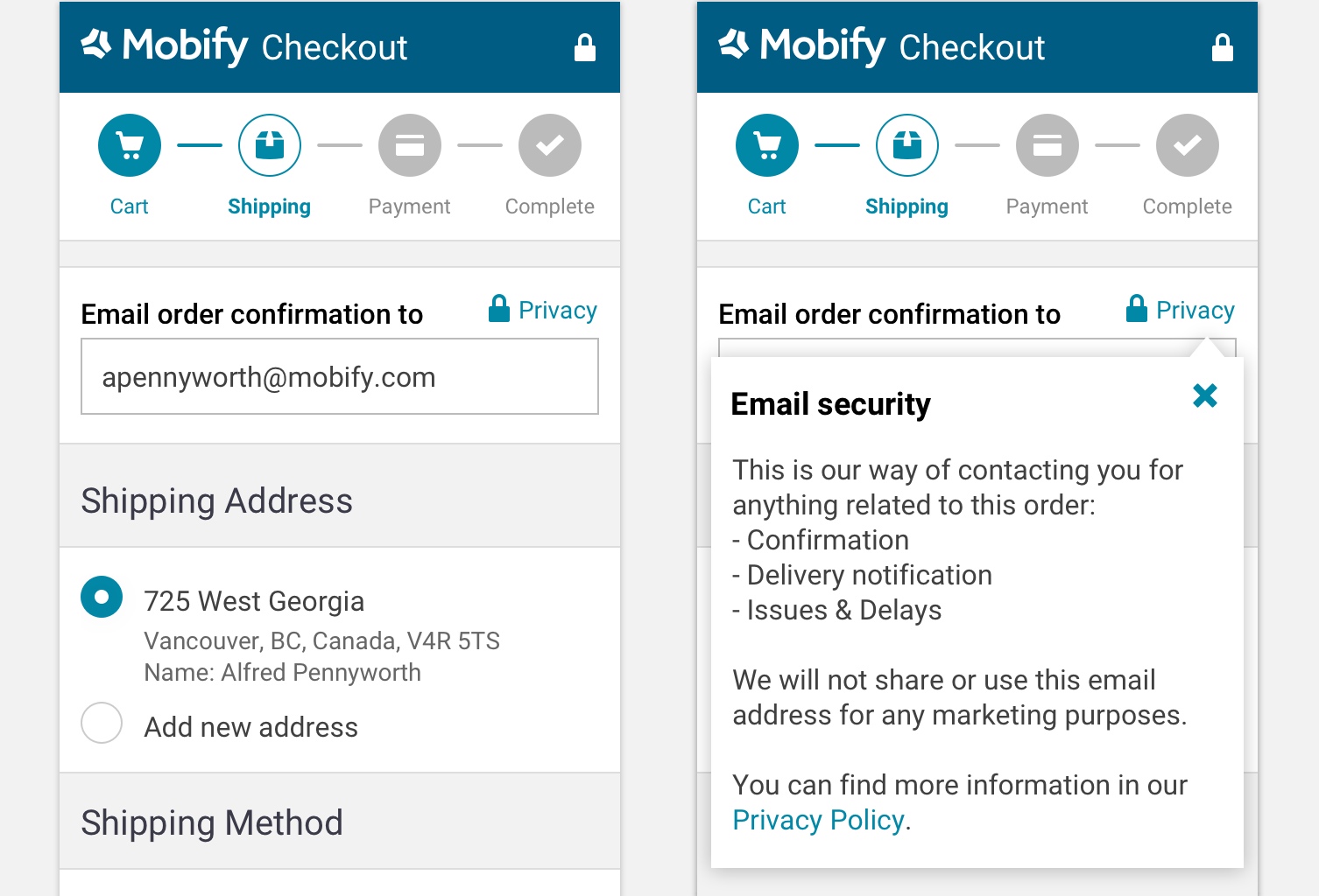
Privacy tooltips & new popover component … We've introduced a new component (Popover) to allow for more information to be expanded inside a tooltip. This is present in the checkout to hold more information about security and privacy.
-
My Account mocks … Within the Best Practice Layouts section are a few My Account mocks featuring a GDPR-compliant level of clarity when users are creating an account.
Need Help?
If you encounter a bug, get stuck on using the kit, or want to see something new added, please open up an issue in the parent GitHub repo, or open up a pull request so that we can have a discussion!
Happy building! ❤️
UI Kit v2.5.1
V2.5.1 fixes various bugs from the 2.5 release.
GDPR updates
This UI Kit release (version 2.5) is a part of Mobify’s May 2018 release. It aligns with the Progressive Mobile SDK: version 1.2. Download the kit on its own by using the Download link, or download the source files and kit requirements from this repo’s master branch.
What’s New?
- Updates to existing InlineAsk component … We've updated our best practice subscription flow to be GPR compliant. Ensuring there is space to offer more explanatory text and links to further information.

- A more effective way for users to opt in … We've added some new patterns to support opt in flows. Instead of using check boxes, use buttons to present the user with a clear choice.
- Privacy tooltips & new popover component … We've introduced a new component (Popover) to allow for more information to be expanded inside a tooltip. This is present in the checkout to hold more information about security and privacy.
- My Account mocks … Within the Best Practice Layouts section are a few My Account mocks featuring a GDPR-compliant level of clarity when users are creating an account.

Was New In v2.4
-
Native Apps Components … We've added support for building native apps through Mobify's Astro framework. The Native Apps components page reflect the supported plugins that power iOS and Android functionality, along with the system modal dialogs that help mock up native user experiences.
-
Native Apps Layouts … To help designers get a head start with Native App layouts we've put together an artboard within the Best Practice Layouts page. This shows how native app components combine with PWA UI to simulate eCommerce templates on iOS and Android devices that look like they belong there.
-
Interactive AMP layouts … The Mobify AMP SDK now supports amp-bind. This component allows more interaction on the AMP pages, including being able to select product options and add items to cart. We've added more support to these interactions in the AMP Components artboard and Best Practice AMP Layouts.
-
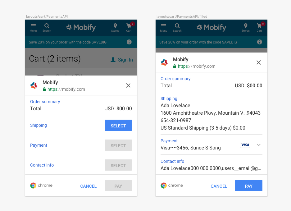
Payment Request API … The express checkout payments sheet powered by Chrome for Android, is now supported on Mobify projects. We've connected the UI to the components page and best practice layouts to help designers mock up this flow, along with UX guidance on Mobify Docs
Need Help?
If you encounter a bug, get stuck on using the kit, or want to see something new added, please open up an issue in the parent GitHub repo, or open up a pull request so that we can have a discussion!
Happy building! ❤️
UI Kit v2.5
GDPR updates
This UI Kit release (version 2.5) is a part of Mobify’s May 2018 release. It aligns with the Progressive Mobile SDK: version 1.2. Download the kit on its own by using the Download link, or download the source files and kit requirements from this repo’s master branch.
What’s New?
- Updates to existing InlineAsk component … We've updated our best practice subscription flow to be GPR compliant. Ensuring there is space to offer more explanatory text and links to further information.
- A more effective way for users to opt in … We've added some new patterns to support opt in flows. Instead of using check boxes, use buttons to present the user with a clear choice.
- Privacy tooltips & new popover component … We've introduced a new component (Popover) to allow for more information to be expanded inside a tooltip. This is present in the checkout to hold more information about security and privacy.
- My Account mocks … Within the Best Practice Layouts section are a few My Account mocks featuring a GDPR-compliant level of clarity when users are creating an account.
Was New In v2.4
-
Native Apps Components … We've added support for building native apps through Mobify's Astro framework. The Native Apps components page reflect the supported plugins that power iOS and Android functionality, along with the system modal dialogs that help mock up native user experiences.
-
Native Apps Layouts … To help designers get a head start with Native App layouts we've put together an artboard within the Best Practice Layouts page. This shows how native app components combine with PWA UI to simulate eCommerce templates on iOS and Android devices that look like they belong there.
-
Interactive AMP layouts … The Mobify AMP SDK now supports amp-bind. This component allows more interaction on the AMP pages, including being able to select product options and add items to cart. We've added more support to these interactions in the AMP Components artboard and Best Practice AMP Layouts.
-
Payment Request API … The express checkout payments sheet powered by Chrome for Android, is now supported on Mobify projects. We've connected the UI to the components page and best practice layouts to help designers mock up this flow, along with UX guidance on Mobify Docs
Need Help?
If you encounter a bug, get stuck on using the kit, or want to see something new added, please open up an issue in the parent GitHub repo, or open up a pull request so that we can have a discussion!
Happy building! ❤️
UI Kit v2.4
Say hello to Native Apps support!
This UI Kit release (version 2.4) is a part of Mobify’s March 2018 product release plan. It aligns with the Progressive Mobile SDK: version 1.1. Download the kit on its own by using the Download link, or download the source files and kit requirements from this repo’s master branch.
What’s New?
- Native Apps Components … We've added support for building native apps through Mobify's Astro framework. The Native Apps components page reflect the supported plugins that power iOS and Android functionality, along with the system modal dialogs that help mock up native user experiences.

- Native Apps Layouts … To help designers get a head start with Native App layouts we've put together an artboard within the Best Practice Layouts page. This shows how native app components combine with PWA UI to simulate eCommerce templates on iOS and Android devices that look like they belong there.

- Interactive AMP layouts … The Mobify AMP SDK now supports amp-bind. This component allows more interaction on the AMP pages, including being able to select product options and add items to cart. We've added more support to these interactions in the AMP Components artboard and Best Practice AMP Layouts.

- Payment Request API … The express checkout payments sheet powered by Chrome for Android, is now supported on Mobify projects. We've connected the UI to the components page and best practice layouts to help designers mock up this flow, along with UX guidance on Mobify Docs
Was New In v2.3
-
Component page … Use this page to locate a component before copying and pasting into your layout design.
-
AMP Components … Mobify's AMP SDK is a collection of components designed to work on Google's Accelerated Mobile Pages. The Components page groups them together so that you know which of the PWA components are AMP-ready.
-
Best Practice Layouts … We've cleaned up the pages and grouped every template under one Layouts page. This makes it easier for developers to find the templates they're looking for, including all additional states and modals.
-
AMP Layouts … Mobify's tried and tested techniques for composing AMP templates using the Mobify AMP SDK suite of components.
Need Help?
If you encounter a bug, get stuck on using the kit, or want to see something new added, please open up an issue in the parent GitHub repo, or open up a pull request so that we can have a discussion!
Happy building! ❤️
UI Kit v2.3.0
Introducing AMP:zap: and a new way to find Components
This UI Kit release (version 2.3) is a part of Mobify’s November product release plan. It aligns with the Progressive Mobile SDK: version 0.23.0. Download the kit on its own by using the Download link, or download the source files and kit requirements from this repo’s master branch. (Both are available below.)
What’s New?
- Component page … We've added a new page, and with it a new way to find the latest SDK components. Instead of using the Symbols page to find and edit components, this page groups all the components together under their respective symbol paths. Use this page to locate a component before copying and pasting into your layout design.

- AMP Components … Mobify's AMP SDK is a collection of components designed to work on Google's Accelerated Mobile Pages. The Components page groups them together so that you know which of the PWA components are AMP-ready. Visually, the AMP and PWA templates should appear the same; therefore, these components are made of the same symbol. Updates to symbols will be applied everywhere.

- Best Practice Layouts … We've cleaned up the pages and grouped every template under one Layouts page. This makes it easier for developers to find the templates they're looking for, including all additional states and modals.
- AMP Layouts … On the UI kit's Best Practice Layouts page we've introduced AMP layouts. These represent Mobify's tried and tested techniques for composing AMP templates using the Mobify AMP SDK suite of components.

- Improved SDK parity … We've worked to reduce any disconnection between the kit and what's in the SDK. This means that any component you choose to include from the Mobify UI kit has a corresponding full tested SDK component (unless indicated on the Components page).
Was New In v2.2.1…
-
Add to Homescreen … a feature of the Android Chrome browser which allows the “installation” of the PWA to a user's homescreen behind an app icon. The user can then launch the site, in the same way they might launch an app, as a focused experience without the browser bar.
-
Share Component … for use anytime the user interaction is to share the URL via email or on social media. The Share function also allows a user to print the page or copy the URL instead of using the browser UI.
-
InlineAsk Component … designed to group together the prompts to sign up to the newsletter and for push notifications. The component can be varied to only show the email option if the device does not support push notifications.
Contribute
Check out the README to see how you can contribute back into the UI Kit.
Need Help?
If you encounter a bug, get stuck on using the kit, or want to see something new added, please open up an issue in the parent GitHub repo, or open up a pull request so that we can have a discussion!
Happy building! ❤️
UI Kit v2.2.1
New PWA-specific components! 🎁
This UI Kit release (version 2.2.1) is a part of Mobify’s September product release plan. It aligns with the Progressive Mobile SDK: version 0.22.1. Download the kit on its own by using the Download link, or download the source files and kit requirements from this repo’s master branch. (Both are available below.)
What’s New?
- Add to Homescreen … a feature of the Android Chrome browser which allows the “installation” of the PWA to a user's homescreen behind an app icon. The user can then launch the site, in the same way they might launch an app, as a focused experience without the browser bar.

- Share Component … for use anytime the user interaction is to share the URL via email or on social media. The Share function also allows a user to print the page or copy the URL instead of using the browser UI.

- Subscription Component … designed to group together the prompts to sign up to the newsletter and for push notifications. The component can be varied to only show the email option if the device does not support push notifications.

Was New In v2.2.0…
-
Accessible Palette: The colours in the UI Kit are designed to be modified to fit any brand, but whatever the new colours may be, they should always pass colour contrast accessibility requirements. We're leading by example with the default colours we use.
-
Higher contrast: Grey-on-grey is hard to read. In this release, we've upped our contrast ratios to pass a11y guidelines in our success/failure messages and our disabled states.
-
Minimal footers: Mobify encourages app-like patterns on the mobile web, this includes favouring minimal, contextual footers over those that clutter up page content and dilute the current task. In this release, you'll see the social icons in the navigation menu, where they belong.
Contribute
Check out the README to see how you can contribute back into the UI Kit.
Need Help?
If you encounter a bug, get stuck on using the kit, or want to see something new added, please open up an issue in the parent GitHub repo, or open up a pull request so that we can have a discussion!
Happy building! ❤️
UI Kit v2.2.0 (Stable)
Building on our first release with some improvements to a11y
We’ve been sending out the UI Kit on an individual basis, but we’re super excited to now open it up to all who want it. This is the first of our continuous improvement releases — introducing 2.2.0! Download a kit on its own, or download the source files and requirements from this repo’s master branch. (Both are available below.)
What’s New?
-
Accessible Palette: The colours in the UI Kit are designed to be modified to fit any brand, but whatever the new colours may be, they should always pass colour contrast accessibility requirements. We're leading by example with the default colours we use.
-
Higher contrast: Grey-on-grey is hard to read. In this release, we've upped our contrast ratios to pass a11y guidelines in our success/failure messages and our disabled states.
-
Minimal footers: Mobify encourages app-like patterns on the mobile web, this includes favouring minimal, contextual footers over those that clutter up page content and dilute the current task. In this release, you'll see the social icons in the navigation menu, where they belong.
Was New In v2.1.0…
-
Resizing Components: We’re taking full advantage of Sketch v.44’s Resizing Controls feature, which allows us to scale components and templates up and down with ease. All components, where applicable, can now smoothly scale to fit your contexts. (Shout out to Jaybe for all the hard work!)
-
Reduced opinions: We’ve reduced the level of prescription around many components, allowing you to customise them to your heart’s content through overrides and other means.
-
New components: There’s a slew of new components and patterns added, such as the ProductTile, extracted from some of Mobify’s latest progressive web app builds.
Contribute
Check out the README to see how you can contribute back into the UI Kit.
Need Help?
If you encounter a bug, get stuck on using the kit, or want to see something new added, please open up an issue in the parent GitHub repo, or open up a pull request so that we can have a discussion!
Happy building! ❤️