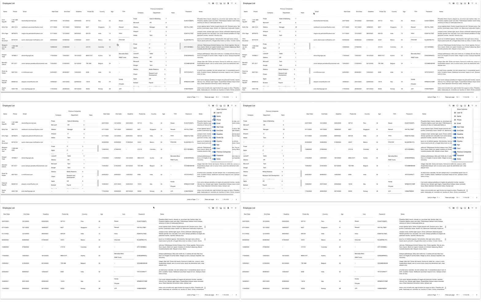
React-Datatable is a responsive datatables component built on MUI-Datatables. It comes with features like sorting, search, customisable layout (view/hide columns, draggable columns, changing number of rows per page), saving of customised layout, customised filtering, saving of filter settings, selectable rows and pagination.
import React, { useState } from "react"
import ReactDataTable from "ReactDataTable";

function DataTable2() {

  const tableName = "Employee List";

  const defaultColumnDetails = [
   {
    name: "name",
    label: "Name",
    options: {
     display: true,
     sort: true,
    }
   },
   {
    name: "company",
    label: "Company",
    options: {
     display: true,
     sort: false,
    }
   },
   {
    name: "city",
    label: "City",
    options: {
     display: true,
     sort: false,
    }
   },
   {
    name: "state",
    label: "State",
    options: {
     display: false,
     sort: false,
    }
   },
  ];

  const [columnDetails, setColumnDetails] = useState(defaultColumnDetails);
  const [columnOrder, setColumnOrder] = useState([0,1,2,3]);
  const [numRowsPerPage, setNumRowsPerPage] = useState(10);

  const data = [
   { name: "Joe James", company: "Test Corp", city: "Yonkers", state: "NY" },
   { name: "John Walsh", company: "Test Corp", city: "Hartford", state: "CT" },
   { name: "Bob Herm", company: "Test Corp", city: "Tampa", state: "FL" },
   { name: "James Houston", company: "Test Corp", city: "Dallas", state: "TX" },
  ];

  tableOptions = {
    options: {
      draggableColumns: {
        enabled: true,
        transitionTime: 300,
      },
      responsive: "standard",
      selectableRowsOnClick: true,
      selectableRowsHideCheckboxes: true,
      rowsPerPageOptions: [10, 20, 50, 100],
      jumpToPage: true,
      rowsPerPage: 10,
      columnOrder: columnOrder,
      customToolbar: true,
      customToolbarSelect: true,
    },
    onViewColumnChange: (newColumnDetails) => {
      console.log(columnDetails);
      console.log(newColumnDetails);
    },
    onColumnOrderChange: (newColumnOrder) => {
      console.log("oldColumnOrder: " + columnOrder);
      console.log("newColumnOrder: " + newColumnOrder);
    },
    onRowsPerPageChange: (newRowsPerPage) => {
      console.log("oldRowsPerPage: " + numRowsPerPage);
      console.log("newRowsPerPage: " + newRowsPerPage);
    },
    onFilterSaveClick: (filterSettings) => {
      console.log(filterSettings);
    },
  };

  return (
    <ReactDataTable
      tableName={tableName}
      data={data}
      defaultColumnDetails={defaultTableColumn}
      columnDetails={columnDetails}
      tableOptions={tableOptions}
    />
  );
}
The component accepts the following props:
| Name | Type | Description |
|---|---|---|
tableName |
array | Name of the table that will be display on the top left corner |
data |
array | Data used to describe table. Must be either an array containing objects of key/value pairs with values that are strings or numbers, or arrays of strings or numbers (Ex: data: [{"Name": "Joe", "Job Title": "Plumber", "Age": 30}, {"Name": "Jane", "Job Title": "Electrician", "Age": 45}] or data: [["Joe", "Plumber", 30], ["Jane", "Electrician", 45]]). The customBodyRender and customBodyRenderLite options can be used to control the data display. |
columnDetails |
array | Details used to describe table. Must be either an array of simple strings or objects describing a column. |
defaultColumnDetails |
array | Default column details that will be reverted to upon clicking on the revert button. Similar to that of columnDetails, it must be either an array of simple strings or objects describing a column. |
tableOptions |
object | Options used to describe table |
TableOptions accepts an 'options' object and 4 other optional callback functions - onViewColumnChange, onColumnOrderChange, onRowsPerPageChange and onFilterSaveClick.
It accepts all options that MUI-Datatables takes in and on top of that, accepts 2 more other options:
| Name | Type | Default | Description |
|---|---|---|---|
customToolbar |
boolean | false | Enable/disable the customed toolbar, which includes customed filters, loading of filters, saving of table layout & filter settings, reverting to the default layout, view/hide columns and search. |
customToolbarSelect |
boolean | false | Enable/disable the customed toolbar upon selection of rows, which includes deselecting all rows and a validation check. |
| Name | Type | Description |
|---|---|---|
onViewColumnChange |
function | Callback function that triggers when a column view has been changed. function(newColumnDetails: object) => void |
onColumnOrderChange |
function | Callback function that triggers when the column order has been changed. function(newColumnOrder: array) => void |
onRowsPerPageChange |
function | Callback function that triggers when the number of rows per page has been changed. function(newRowsPerPage: number) => void |
onFilterSaveClick |
function | Callback function that triggers when the save filter settings button has been click. function(filterSettings: array) => void |