
Free and open source professional-grade UI components that seamlessly integrate with Dynamics 365, giving your forms, ribbons, and custom pages the same polished look and feel as native D365 interfaces.
Note: Available as
window.uiLib(recommended) orwindow.err403(backward compatibility). Both names work identically - use whichever you prefer.
Disclaimer: This is a free, open-source project provided "as-is" without any warranty or support. Use at your own risk. The authors and contributors take no responsibility for any issues, data loss, or problems that may arise from using this library. You are free to fork, modify, and distribute this project under the terms of the license.
Stop wrestling with custom HTML and CSS. This library provides production-ready components that match Microsoft's Fluent UI design system, ensuring your customizations look and feel like they belong in Dynamics 365.
✅ Free & Open Source - MIT License, fork and customize as needed
✅ Matches Dynamics 365 Design - Uses Microsoft Fluent UI v9 components for authentic D365 styling
✅ Simple Vanilla API - Clean JavaScript API, no React knowledge required
✅ Easy to Use - Simple API, complete examples, works with form scripts and ribbon buttons
✅ Production Ready - Validated, tested, and optimized for D365 environments
✅ Fully Typed - Built with TypeScript for better IntelliSense and fewer bugs
Show success messages, warnings, and errors that appear in the top-right corner, just like D365's native notifications. Perfect for confirming actions, displaying errors, or keeping users informed.
Create professional forms, wizards, and confirmation dialogs with full validation, tabs, progress indicators, conditional field visibility and requirements, and custom fields. Build complex data entry experiences that feel native to D365.
Key Features:
- ✨ Conditional Field Visibility - Show/hide fields based on other field values
- 🔒 Conditional Required Fields - Make fields required based on other field values
- 🧙 Visual Wizard Steps - Step indicators with circles, checkmarks, and validation states
- 📊 All Field Types - Text, number, date, switch, checkbox, slider, textarea, dropdown with badges, table, lookup
- 🎨 Fluent UI Styling - Authentic D365 appearance with filled-darker inputs
- 🖥️ Fullscreen Mode - Toggle between normal and fullscreen display
- 🔍 Inline Lookups - D365-native lookup dropdowns with entity icons
- 🏷️ Badge Display Mode - Show dropdown options as clickable badges
Powerful record selection with two modes:
- Inline Dropdown Lookup - Search and select records in a dropdown (D365 native style)
- Modal Dialog Lookup - Full-screen lookup with table, search, filter, and multi-select
A visual drag-and-drop interface for building modal dialogs without writing code:
- Drag & Drop Fields - Drag field types from the palette onto your modal
- Visual Configuration - Configure field properties, validation, and visibility
- Live Preview - See your modal in real-time as you build
- Code Export - Generate ready-to-use JavaScript/TypeScript code
- Wizard Support - Build multi-step wizard dialogs visually
- Save & Load - Save configurations and reload them later
Beta Notice: The Modal Builder is currently in beta. Some features may be incomplete or change in future releases.
Vanilla JavaScript API with Fluent UI Components
This library provides a simple vanilla JavaScript API that works seamlessly with D365 form scripts and ribbon buttons. Behind the scenes, it uses:
- Microsoft Fluent UI v9 - Professional React components for authentic D365 styling
- React 19 - Modern UI framework (bundled internally, invisible to your code)
- TypeScript - Type-safe development with full IntelliSense support
- ✨ TabList & Tooltip - Native Fluent UI tab navigation and tooltips
- 📊 DataGrid - High-performance sortable tables with selection
- 🔔 Toast/Toaster - Fluent UI toast notifications with intents
- 🎛️ Switch - Modern toggle switches
- 🔘 Button - Fluent UI buttons with primary/secondary appearances
// You write simple vanilla JavaScript
uiLib.Toast.success({ title: 'Done!', message: 'Record saved' });

// Library handles React rendering internally
// ↓ Converts to Fluent UI React components
// ↓ Mounts to DOM with proper theming
// ↓ User sees polished D365-style toast
Benefits:
- No React knowledge required
- No build process for your code
- Automatic D365 theme matching
- Production-optimized bundle (280 KB gzipped)
Step 1: Download Solution
Download the solution package from the releases folder:
err403UILibrary_1_0_0.zip(managed solution)
Step 2: Import Solution
Import into your Dynamics 365 environment:
- Navigate to Settings → Solutions
- Click Import
- Select the downloaded ZIP file
- Complete the import wizard
- Wait for import to complete
Step 3: Add to Form
Add as a form library (one-time setup per form):
- Open your form in form designer
- Click Form Properties
- Go to Events tab → Form Libraries
- Click Add and select
err403_/ui-lib.min.js - Move it to the top of the library list
- Save and publish
That's it! The library is now available to all scripts on the form.
Optional: Register OnLoad Event
If you want to initialize the library on form load, you can use uiLib.init directly as the event handler — no custom wrapper function needed:
| Property | Value |
|---|---|
| Library | err403_/ui-lib.min.js |
| Function | uiLib.init |
| Pass execution context | ☑ Enabled |
This initializes the library and loads the CSS. You can also call uiLib.init from your own OnLoad function if you need additional logic:
// In your form OnLoad event
function onLoad(executionContext) {
  const health = uiLib.init(executionContext);
  if (!health.loaded) return;

  uiLib.Toast.success({ message: 'Library ready!' });
}Scenario 1: Form OnLoad Event (Main Form)
// In your form's OnLoad event handler
function myFormOnLoad(executionContext) {
  // Initialize the library first
  const health = uiLib.init(executionContext);

  if (!health.loaded) {
    console.error('UI Library failed to load');
    return;
  }

  // Now use the library
  const formContext = executionContext.getFormContext();
  const accountName = formContext.getAttribute('name').getValue();

  if (accountName) {
    uiLib.Toast.success({
      title: 'Welcome',
      message: `Editing: ${accountName}`
    });
  }
}
Scenario 2: Field OnChange Event
// In a field's OnChange handler
function onIndustryChange(executionContext) {
  const formContext = executionContext.getFormContext();
  const industry = formContext.getAttribute('industrycode').getValue();

  // Library is already loaded from form OnLoad
  if (industry === 1) { // Technology
    uiLib.Toast.info({
      message: 'Technology industry selected - additional fields may be required'
    });
  }
}
Scenario 3: Ribbon Button Command
// In a ribbon button command function
function onCustomButtonClick() {
  // No executionContext available in ribbon commands
  // But library is already loaded from form

  const selectedRecords = Xrm.Page.getControl('grid').getGrid().getSelectedRows();

  if (selectedRecords.length === 0) {
    uiLib.Toast.warn({ message: 'Please select at least one record' });
    return;
  }

  uiLib.Modal.confirm(
    'Bulk Update',
    `Update ${selectedRecords.length} record(s)?`
  ).then(confirmed => {
    if (confirmed) {
      // Perform bulk operation
      processBulkUpdate(selectedRecords);
    }
  });
}
Scenario 4: Web Resource in Iframe
// Custom HTML web resource embedded in form iframe
// The library auto-detects it's in an iframe and finds the parent instance

function initCustomWebResource() {
  // Check if library is available (auto-assigned from parent)
  if (typeof uiLib === 'undefined') {
    console.error('UI Library not found in parent window');
    return;
  }

  // Use library normally
  document.getElementById('myButton').addEventListener('click', function() {
    uiLib.Toast.success({ message: 'Button clicked in iframe!' });
  });
}

// Wait for DOM to load
window.addEventListener('DOMContentLoaded', initCustomWebResource);
Scenario 5: Business Rule Alternative
// Use instead of business rules for complex logic
function onAccountTypeChange(executionContext) {
  const formContext = executionContext.getFormContext();
  const accountType = formContext.getAttribute('accounttype').getValue();

  // Show/hide fields dynamically
  if (accountType === 3) { // Partner
    formContext.ui.tabs.get('tab_partner').setVisible(true);

    uiLib.Toast.info({
      title: 'Partner Account',
      message: 'Additional partner information is required',
      duration: 5000
    });
  } else {
    formContext.ui.tabs.get('tab_partner').setVisible(false);
  }
}See the library in action:
- Demo Page:
https://[your-org].dynamics.com/WebResources/err403_/demo.html - Test Suite:
https://[your-org].dynamics.com/WebResources/err403_/tests.html
The solution includes copilot-instructions.md - a comprehensive guide for AI agents (GitHub Copilot, Claude, etc.) to help you build complex modals, forms, and wizards faster. Point your AI assistant to this file for accurate code generation with all library features.
Show feedback to users after they perform actions:
// When a record is saved successfully
function onSave(executionContext) {
  uiLib.Toast.success({
    title: 'Success',
    message: 'Contact saved successfully!',
    duration: 3000,
    sound: true
  });
}

// When validation fails
function validatePhoneNumber(executionContext) {
  var phone = Xrm.Page.getAttribute('telephone1').getValue();

  if (!phone || phone.length < 10) {
    uiLib.Toast.error({
      title: 'Validation Error',
      message: 'Phone number must be at least 10 digits',
      duration: 5000
    });
    return false;
  }
  return true;
}

// Show a warning
function showDataWarning() {
  uiLib.Toast.warn({
    title: 'Data Notice',
    message: 'This record is missing required information',
    duration: 4000
  });
}Ask users to confirm before deleting a record:
function confirmDelete(recordId) {
  uiLib.Modal.confirm(
    'Delete Record',
    'Are you sure you want to delete this record? This cannot be undone.'
  ).then(function(confirmed) {
    if (confirmed) {
      // User clicked OK
      Xrm.WebApi.deleteRecord('account', recordId).then(function() {
        uiLib.Toast.success({ message: 'Record deleted' });
      });
    }
    // User clicked Cancel - do nothing
  });
}Show important information to users:
function showLicenseInfo() {
  uiLib.Modal.alert(
    'License Expiring',
    'Your license will expire in 30 days. Please contact your administrator.'
  );
}Build a complete data entry form with validation:
function createContact() {
  var modal = new uiLib.Modal({
    title: 'Create New Contact',
    size: 'medium',
    fields: [
      {
        id: 'firstname',
        label: 'First Name',
        type: 'text',
        required: true,
        placeholder: 'Enter first name'
      },
      {
        id: 'lastname',
        label: 'Last Name',
        type: 'text',
        required: true,
        placeholder: 'Enter last name'
      },
      {
        id: 'email',
        label: 'Email',
        type: 'email',
        required: true,
        placeholder: 'contact@example.com'
      },
      {
        id: 'phone',
        label: 'Phone',
        type: 'tel',
        placeholder: '(555) 123-4567'
      },
      {
        id: 'preferredcontactmethod',
        label: 'Preferred Contact Method',
        type: 'select',
        options: ['Email', 'Phone', 'Mail']
      }
    ],
    buttons: [
      new uiLib.Button({ label: 'Cancel', callback: () => {}, id: 'cancelBtn' }),
      new uiLib.Button({
        label: 'Create Contact',
        callback: function() {
          // Get form data
          var data = modal.getFieldValues();

          // Check required fields
          if (!data.firstname || !data.lastname || !data.email) {
            uiLib.Toast.error({ message: 'Please fill in all required fields' });
            return false; // Keep modal open
          }

          // Create the contact record
          var contact = {
            firstname: data.firstname,
            lastname: data.lastname,
            emailaddress1: data.email,
            telephone1: data.phone
          };

          Xrm.WebApi.createRecord('contact', contact).then(
            function success(result) {
              uiLib.Toast.success({
                message: 'Contact created successfully!'
              });
              console.debug('Created contact ID:', result.id);
            },
            function error(err) {
              uiLib.Toast.error({
                message: 'Failed to create contact: ' + err.message
              });
            }
          );

          return true; // Close modal
        },
        setFocus: true,
        requiresValidation: true,  // Button disabled until required fields are filled
        id: 'createBtn'
      })
    ]
  });

  modal.show();
}
💡 Tip: Automatic Button Validation
Use requiresValidation: true to automatically disable buttons until all required fields are valid:
// Button auto-disabled until form is complete
new uiLib.Button({
  label: 'Submit',
  callback: () => { /* submit */ },
  requiresValidation: true,  // ⚡ Auto-validates form
  setFocus: true,
  id: 'submitBtn'
})

// In wizards: validates ALL steps by default
new uiLib.Button({
  label: 'Apply Changes',
  callback: () => { /* submit */ },
  requiresValidation: true,  // ⚡ Validates ALL steps (default in wizards)
  setFocus: true,
  id: 'applyBtn'
})

// To validate only current step (e.g., for Next button)
new uiLib.Button({
  label: 'Next',
  callback: () => { wizard.nextStep(); return false; },
  requiresValidation: true,
  validateAllSteps: false,   // ⚡ Only validates CURRENT step
  setFocus: true,
  id: 'nextBtn'
})

// Respects: hidden fields (visibleWhen), conditional requirements (requiredWhen)Guide users through a complex process with modal-level and step-level messaging:
function runAccountSetupWizard() {
  var modal = uiLib.Modal.open({
    title: 'Account Setup Wizard',
    message: 'Complete all steps to create your account. This message stays visible throughout the wizard.',
    content: '<div style="padding: 8px; background: #f3f2f1; border-radius: 4px;"><strong>Tip:</strong> All fields marked with * are required.</div>',
    size: 'large',
    progress: {
      enabled: true,
      type: 'steps-left', // Show step indicators on the left
      currentStep: 1,
      totalSteps: 3,
      steps: [
        {
          id: 'step1',
          label: 'Basic Info',
          name: 'Basic Information',
          description: 'Enter account details',
          message: 'Step 1: Enter the basic account information below.',
          content: '<small>This information will be used to identify the account in the system.</small>',
          fields: [
            {
              id: 'accountname',
              label: 'Account Name',
              type: 'text',
              required: true
            },
            {
              id: 'accountnumber',
              label: 'Account Number',
              type: 'text'
            },
            {
              id: 'industrycode',
              label: 'Industry',
              type: 'select',
              options: ['Technology', 'Manufacturing', 'Services']
            }
          ]
        },
        {
          id: 'step2',
          label: 'Address',
          name: 'Address Information',
          description: 'Enter business address',
          message: 'Step 2: Provide the primary business address.',
          content: '<small>This address will be used for official correspondence.</small>',
          fields: [
            {
              id: 'address1_line1',
              label: 'Street Address',
              type: 'text'
            },
            {
              id: 'address1_city',
              label: 'City',
              type: 'text'
            },
            {
              id: 'address1_stateorprovince',
              label: 'State/Province',
              type: 'text'
            },
            {
              id: 'address1_postalcode',
              label: 'Postal Code',
              type: 'text'
            }
          ]
        },
        {
          id: 'step3',
          label: 'Review',
          name: 'Review & Submit',
          description: 'Review your information',
          message: 'Step 3: Review your information before submitting.',
          content: '<small>You can go back to previous steps to make changes if needed.</small>',
          fields: [
            {
              id: 'description',
              label: 'Additional Notes',
              type: 'textarea',
              rows: 4,
              placeholder: 'Any additional information...'
            }
          ]
        }
      ]
    },
    buttons: [
      new uiLib.Button({
        label: 'Previous',
        callback: () => { modal.previousStep(); return false; },
        id: 'prevBtn'
      }),
      new uiLib.Button({
        label: 'Next',
        callback: () => { modal.nextStep(); return false; },
        setFocus: true,
        requiresValidation: true,
        validateAllSteps: false,   // Only validate current step for Next button
        id: 'nextBtn'
      }),
      new uiLib.Button({
        label: 'Finish',
        callback: function() {
          var data = modal.getFieldValues();

          // Create the account
          Xrm.WebApi.createRecord('account', data).then(function(result) {
            uiLib.Toast.success({ message: 'Account created successfully!' });
          });

          return true; // Close modal
        },
        setFocus: true,
        requiresValidation: true,  // Validates ALL steps by default in wizards
        id: 'finishBtn'
      })
    ]
  });
}
Understanding Modal vs Step Messaging:
When creating wizards, you have two levels of messaging:
| Level | Properties | Location | Behavior | Use Case |
|---|---|---|---|---|
| Modal | message, content |
Above step indicator | Stays visible for all steps | Overall instructions, wizard purpose, general help |
| Step | message, content |
Below step indicator | Changes per step | Step-specific guidance, field explanations, tips |
Visual Layout:
┌─────────────────────────────────┐
│ Wizard Title                    │
│ Modal Message (stays visible)   │ ← Parent level
│ Modal Content (stays visible)   │
├─────────────────────────────────┤
│ ● ─── ○ ─── ○                  │ ← Step Indicator
├─────────────────────────────────┤
│ Step Message (changes per step) │ ← Step level
│ Step Content (changes per step) │
│ [Form Fields for this step]     │
└─────────────────────────────────┘
This two-level approach provides clear context at both the wizard and individual step levels, improving user experience.
Show or hide fields based on other field values - perfect for dynamic forms:
function createAccountWithConditionalFields() {
  const modal = new uiLib.Modal({
    title: 'New Account',
    size: 'medium',
    fields: [
      // Control field
      {
        id: 'accountType',
        label: 'Account Type',
        type: 'select',
        options: ['Business', 'Individual'],
        value: 'Business'
      },

      // Business fields - only visible when accountType is 'Business'
      {
        id: 'companyName',
        label: 'Company Name',
        type: 'text',
        required: true,
        visibleWhen: { field: 'accountType', operator: 'equals', value: 'Business' }
      },
      {
        id: 'taxId',
        label: 'Tax ID',
        type: 'text',
        visibleWhen: { field: 'accountType', operator: 'equals', value: 'Business' }
      },

      // Individual fields - only visible when accountType is 'Individual'
      {
        id: 'firstName',
        label: 'First Name',
        type: 'text',
        required: true,
        visibleWhen: { field: 'accountType', operator: 'equals', value: 'Individual' }
      },
      {
        id: 'lastName',
        label: 'Last Name',
        type: 'text',
        required: true,
        visibleWhen: { field: 'accountType', operator: 'equals', value: 'Individual' }
      },

      // Marketing preferences with dependent fields
      {
        id: 'allowMarketing',
        label: 'Allow Marketing Communications',
        type: 'switch',
        value: true
      },
      {
        id: 'emailNotifications',
        label: 'Email Notifications',
        type: 'switch',
        visibleWhen: { field: 'allowMarketing', operator: 'truthy' }
      },
      {
        id: 'smsAlerts',
        label: 'SMS Alerts',
        type: 'switch',
        visibleWhen: { field: 'allowMarketing', operator: 'truthy' }
      }
    ],
    buttons: [
      new uiLib.Button('Cancel', () => {}),
      new uiLib.Button('Save', () => {
        const data = modal.getFieldValues();
        console.debug('Account data:', data);
        uiLib.Toast.success({ title: 'Saved', message: 'Account created successfully' });
        return true;
      }, true)
    ]
  });
  modal.show();
}

// Available operators for visibleWhen:
// - 'equals': field === value
// - 'notEquals': field !== value
// - 'contains': string contains substring
// - 'greaterThan': number > value
// - 'lessThan': number < value
// - 'truthy': !!field (any truthy value)
// - 'falsy': !field (any falsy value)Make fields required based on other field values using requiredWhen:
function createFlexibleContactForm() {
  const modal = new uiLib.Modal({
    title: 'New Contact',
    size: 'medium',
    fields: [
      {
        id: 'firstname',
        label: 'First Name',
        type: 'text',
        required: true  // Always required
      },
      {
        id: 'lastname',
        label: 'Last Name',
        type: 'text',
        required: true
      },

      // Preferred contact method
      {
        id: 'preferredcontactmethod',
        label: 'Preferred Contact Method',
        type: 'select',
        options: ['Email', 'Phone', 'Mail'],
        required: true
      },

      // Email - required only if preferred method is Email
      {
        id: 'emailaddress1',
        label: 'Email',
        type: 'email',
        requiredWhen: { field: 'preferredcontactmethod', operator: 'equals', value: 'Email' }
      },

      // Phone - required only if preferred method is Phone
      {
        id: 'telephone1',
        label: 'Phone',
        type: 'tel',
        requiredWhen: { field: 'preferredcontactmethod', operator: 'equals', value: 'Phone' }
      },

      // Address fields - required only if preferred method is Mail
      {
        id: 'address1_line1',
        label: 'Street Address',
        type: 'text',
        requiredWhen: { field: 'preferredcontactmethod', operator: 'equals', value: 'Mail' }
      },
      {
        id: 'address1_city',
        label: 'City',
        type: 'text',
        requiredWhen: { field: 'preferredcontactmethod', operator: 'equals', value: 'Mail' }
      },
      {
        id: 'address1_postalcode',
        label: 'Postal Code',
        type: 'text',
        requiredWhen: { field: 'preferredcontactmethod', operator: 'equals', value: 'Mail' }
      },

      // Business card checkbox
      {
        id: 'hasBusinessCard',
        label: 'I have a business card',
        type: 'checkbox'
      },

      // Job title - required only if has business card
      {
        id: 'jobtitle',
        label: 'Job Title',
        type: 'text',
        requiredWhen: { field: 'hasBusinessCard', operator: 'truthy' }
      },
      {
        id: 'companyname',
        label: 'Company',
        type: 'text',
        requiredWhen: { field: 'hasBusinessCard', operator: 'truthy' }
      }
    ],
    buttons: [
      new uiLib.Button('Cancel', () => {}),
      new uiLib.Button('Save', () => {
        const data = modal.getFieldValues();
        console.debug('Contact data:', data);
        uiLib.Toast.success({ title: 'Saved', message: 'Contact created successfully' });
        return true;
      }, true)
    ]
  });
  modal.show();
}

// Note: requiredWhen uses the same operators as visibleWhen
// Both visibleWhen and requiredWhen can be used on the same fieldReact to field value changes with custom logic:
function createOrderForm() {
  const modal = new uiLib.Modal({
    title: 'Create Order',
    fields: [
      // Customer address lookup with onChange
      {
        id: 'customerAddress',
        label: 'Customer Address',
        type: 'lookup',
        entityName: 'customeraddress',
        lookupColumns: ['line1', 'city', 'postalcode'],
        onChange: async (value) => {
          if (value && value.length > 0) {
            // Load related data when address selected
            const addressId = value[0].id;

            modal.getButton('loadBtn').setLabel('Loading...').disable();

            try {
              const details = await Xrm.WebApi.retrieveRecord(
                'customeraddress',
                addressId,
                '?$select=shippingmethodcode'
              );

              // Update other fields based on selection
              modal.setFieldValue('shippingMethod', details.shippingmethodcode);

              uiLib.Toast.success({ message: 'Address details loaded' });
            } catch (error) {
              uiLib.Toast.error({ message: 'Failed to load details' });
            } finally {
              modal.getButton('loadBtn').setLabel('Load').enable();
            }
          } else {
            // Clear dependent fields when selection is cleared
            modal.setFieldValue('shippingMethod', '');
          }
        }
      },

      // Shipping method field (populated by onChange)
      {
        id: 'shippingMethod',
        label: 'Shipping Method',
        type: 'select',
        options: ['Standard', 'Express', 'Overnight']
      },

      // Quantity field with onChange validation
      {
        id: 'quantity',
        label: 'Quantity',
        type: 'number',
        onChange: (value) => {
          if (value > 100) {
            uiLib.Toast.warn({
              message: 'Large order quantity - please confirm with manager'
            });
          }
        }
      },

      // Account type with onChange to toggle fields
      {
        id: 'accountType',
        label: 'Account Type',
        type: 'select',
        options: ['Retail', 'Wholesale'],
        onChange: (value) => {
          // Could also use visibleWhen, but onChange gives more control
          if (value === 'Wholesale') {
            uiLib.Toast.info({
              message: 'Wholesale accounts receive automatic 15% discount'
            });
          }
        }
      }
    ],
    buttons: [
      new uiLib.Button({ label: 'Cancel', callback: () => {}, id: 'cancelBtn' }),
      new uiLib.Button({
        label: 'Load',
        callback: () => false,
        id: 'loadBtn'
      }),
      new uiLib.Button({
        label: 'Create Order',
        callback: () => {
          const data = modal.getFieldValues();
          console.debug('Order data:', data);
          return true;
        },
        setFocus: true,
        id: 'createBtn'
      })
    ]
  });
  modal.show();
}

// onChange return values are ignored - use for side effects only
// onChange fires whenever field value changes (user input, setFieldValue, etc.)Automatically load option set values from Dynamics 365 metadata:
function createLeadForm() {
  const modal = new uiLib.Modal({
    title: 'Create Lead',
    fields: [
      {
        id: 'firstname',
        label: 'First Name',
        type: 'text',
        required: true
      },
      {
        id: 'lastname',
        label: 'Last Name',
        type: 'text',
        required: true
      },
      { id: 'lastname', label: 'Last Name', type: 'text', required: true },
      { id: 'emailaddress1', label: 'Email', type: 'email', required: true },
      // Auto-fetch Industry option set
      {
        id: 'industrycode',
        type: 'select',
        optionSet: {
          entityName: 'lead',
          attributeName: 'industrycode',
          includeNull: true,      // Add blank option
          sortByLabel: true        // Sort alphabetically
        }
      },
      // Auto-fetch Lead Source
      {
        id: 'leadsourcecode',
        type: 'select',
        optionSet: {
          entityName: 'lead',
          attributeName: 'leadsourcecode',
          includeNull: true
        }
      },
      // Auto-fetch Rating
      {
        id: 'leadqualitycode',
        type: 'select',
        optionSet: {
          entityName: 'lead',
          attributeName: 'leadqualitycode'
        }
      }
    ],
    buttons: [
      new uiLib.Button({ label: 'Cancel', callback: () => {}, id: 'cancelBtn' }),
      new uiLib.Button({
        label: 'Create Lead',
        callback: function() {
          const data = modal.getFieldValues();

          Xrm.WebApi.createRecord('lead', {
            firstname: data.firstname,
            lastname: data.lastname,
            emailaddress1: data.emailaddress1,
            industrycode: parseInt(data.industrycode),
            leadsourcecode: parseInt(data.leadsourcecode),
            leadqualitycode: parseInt(data.leadqualitycode)
          }).then(() => {
            uiLib.Toast.success({ message: 'Lead created successfully' });
          });

          return true;
        },
        setFocus: true,
        id: 'createBtn'
      })
    ]
  });
  modal.show();
}

// The library automatically:
// 1. Fetches option set metadata from D365
// 2. Populates dropdown with options (text/value pairs)
// 3. Uses attribute display name as label (if not provided)
// 4. Handles both local and global option sets
// 5. Returns option set VALUE (integer) when getFieldValues() is calledAuto-complete addresses with country restrictions. The addressLookup field stores the complete address object with all components:
function createContactWithAddress() {
  const modal = new uiLib.Modal({
    title: 'New Contact with Address',
    fields: [
      { id: 'firstname', label: 'First Name', type: 'text', required: true },
      { id: 'lastname', label: 'Last Name', type: 'text', required: true },
      { id: 'email', label: 'Email', type: 'email', required: true },

      // Address lookup field with Google Maps
      {
        id: 'businessAddress',
        label: 'Business Address',
        type: 'addressLookup',
        addressLookup: {
          provider: 'google', // or 'azure'
          apiKey: 'YOUR_GOOGLE_MAPS_API_KEY', // or Azure Maps subscription key
          placeholder: 'Start typing an address...',
          componentRestrictions: { country: ['nz', 'au'] }, // Optional: restrict to countries
          fields: { // Optional: auto-populate related fields
            street: 'address1_line1',
            city: 'address1_city',
            state: 'address1_stateorprovince',
            postalCode: 'address1_postalcode',
            country: 'address1_country',
            latitude: 'address1_latitude',
            longitude: 'address1_longitude'
          },
          onSelect: (address) => {
            console.debug('Selected address:', address);
            // address = { formattedAddress, street, city, state, postalCode, country, latitude, longitude }
            uiLib.Toast.success({
              message: `Address: ${address.formattedAddress}`
            });
          }
        }
      },

      // These fields will be auto-populated by the address lookup (optional)
      { id: 'address1_line1', label: 'Street', type: 'text' },
      { id: 'address1_city', label: 'City', type: 'text' },
      { id: 'address1_stateorprovince', label: 'State', type: 'text' },
      { id: 'address1_postalcode', label: 'Postal Code', type: 'text' },
      { id: 'address1_country', label: 'Country', type: 'text' },
      { id: 'address1_latitude', label: 'Latitude', type: 'number' },
      { id: 'address1_longitude', label: 'Longitude', type: 'number' }
    ],
    buttons: [
      new uiLib.Button('Create Contact', function() {
        const data = modal.getFieldValues();

        // The businessAddress field contains the full address object:
        console.debug(data.businessAddress);
        // {
        //   formattedAddress: "9 Clendon Court, Templestowe VIC 3106, Australia",
        //   street: "9 Clendon Court",
        //   city: "Templestowe",
        //   state: "Victoria",
        //   postalCode: "3106",
        //   country: "Australia",
        //   latitude: -37.7566088,
        //   longitude: 145.1612761
        // }

        // Create contact with address in D365
        Xrm.WebApi.createRecord('contact', {
          firstname: data.firstname,
          lastname: data.lastname,
          emailaddress1: data.email,
          address1_line1: data.address1_line1,
          address1_city: data.address1_city,
          address1_stateorprovince: data.address1_stateorprovince,
          address1_postalcode: data.address1_postalcode,
          address1_country: data.address1_country,
          address1_latitude: parseFloat(data.address1_latitude),
          address1_longitude: parseFloat(data.address1_longitude)
        }).then(() => {
          uiLib.Toast.success({ message: 'Contact created with address' });
        });

        return true;
      }, true)
    ]
  });
  modal.show();
}

// Azure Maps alternative:
// addressLookup: {
//   provider: 'azure',
//   apiKey: 'YOUR_AZURE_MAPS_SUBSCRIPTION_KEY',
//   componentRestrictions: { country: 'AU' }, // Single country
//   ...
// }

// Without field auto-population (address object only):
// addressLookup: {
//   provider: 'google',
//   apiKey: 'YOUR_API_KEY',
//   // No 'fields' property - just stores the address object
// }Let users search and select records:
function selectAccount() {
  // Modal Dialog Lookup (full-screen with table)
  new uiLib.Lookup({
    entityName: 'account',
    tableColumns: [
      { id: 'name', header: 'Account Name', sortable: true, elastic: true },
      { id: 'accountnumber', header: 'Account #', sortable: true, width: '140px' },
      { id: 'telephone1', header: 'Phone', width: '140px' },
      { id: 'address1_city', header: 'City', sortable: true, width: '120px' }
    ],
    searchFields: ['name', 'accountnumber'], // Search in these visible fields
    additionalSearchFields: ['emailaddress1', 'websiteurl'], // Also search email/website but don't display
    onSelect: function(results) {
      if (results.length > 0) {
        var account = results[0];

        // Set the value on the current form
        Xrm.Page.getAttribute('parentaccountid').setValue([{
          id: account.accountid, // Use entity ID field
          name: account.name,
          entityType: 'account'
        }]);

        uiLib.Toast.success({
          message: 'Selected: ' + account.name
        });
      }
    }
  }).show();
}
Lookup Behavior: The Modal Dialog Lookup provides a full-screen interface with search, filtering, sorting, and multi-select capabilities. Use inline lookup fields (type: 'lookup') for simpler dropdown selection.
Add dropdown or lookup filters between the search box and results table:
function selectOpportunity() {
  new uiLib.Lookup({
    entityName: 'opportunity',
    tableColumns: [
      { id: 'name', header: 'Opportunity', sortable: true, elastic: true },
      { id: 'estimatedvalue', header: 'Est. Value', sortable: true, align: 'right', format: 'currency', width: '140px' },
      { id: 'closeprobability', header: 'Probability', sortable: true, align: 'right', format: 'percent', width: '120px' }
    ],
    preFilters: [
      // Auto-populated from D365 option set metadata
      { type: 'optionset', attribute: 'statecode', label: 'Status' },
      // Static dropdown
      {
        type: 'select', attribute: 'prioritycode', label: 'Priority',
        options: [
          { label: 'High', value: '1' },
          { label: 'Normal', value: '2' },
          { label: 'Low', value: '3' }
        ]
      },
      // Lookup — filter by related record
      {
        type: 'lookup', attribute: 'parentaccountid', label: 'Account',
        entityName: 'account', lookupColumns: ['name', 'accountnumber']
      }
    ],
    onSelect: function(results) {
      if (results.length > 0) {
        uiLib.Toast.success({ message: 'Selected: ' + results[0].name });
      }
    }
  }).show();
}
PreFilter types:
| Type | Description | Key Properties |
|---|---|---|
optionset |
Auto-populated from D365 metadata | attribute, label, includeAll, defaultValue |
select |
Static dropdown with manual options | attribute, label, options, includeAll, defaultValue |
lookup |
Related record picker | attribute, label, entityName, lookupColumns, filters |
Show only records that match specific criteria:
function selectActiveAccount() {
  // Modal Dialog Lookup with filtering
  new uiLib.Lookup({
    entityName: 'account',
    tableColumns: [
      { id: 'name', header: 'Account Name', sortable: true, elastic: true },
      { id: 'accountnumber', header: 'Account #', sortable: true, width: '140px' },
      { id: 'revenue', header: 'Revenue', sortable: true, align: 'right', format: 'currency', width: '140px' }
    ],
    filters: 'statecode eq 0', // OData filter for active records
    multiple: false, // Single selection
    onSelect: function(results) {
      if (results.length > 0) {
        const account = results[0];
        console.debug('Selected account:', account.name);

        uiLib.Toast.success({
          message: 'Selected: ' + account.name
        });
      }
    }
  }).show();
}Display tabular data with sorting, selection, and customizable columns:
function showContactsTable() {
  // Fetch contacts from D365
  Xrm.WebApi.retrieveMultipleRecords('contact', '?$select=fullname,emailaddress1,telephone1,jobtitle,birthdate&$top=50')
    .then(function(result) {
      var modal = new uiLib.Modal({
        title: 'Contact List',
        size: 'large',
        fields: [
          new uiLib.Table({
            id: 'contactsTable',
            label: 'Contacts',
            tableColumns: [
              { id: 'fullname', header: 'Full Name', visible: true, sortable: true, width: '200px' },
              { id: 'emailaddress1', header: 'Email', visible: true, sortable: true, elastic: true },
              { id: 'telephone1', header: 'Phone', visible: true, sortable: false, width: '150px' },
              { id: 'jobtitle', header: 'Job Title', visible: true, sortable: true, width: '180px' },
              { id: 'birthdate', header: 'Birth Date', visible: false } // Hidden column
            ],
            data: result.entities,
            selectionMode: 'multiple', // Options: 'none', 'single', 'multiple'
            onRowSelect: function(selectedRows) {
              console.debug('Selected contacts:', selectedRows);
              uiLib.Toast.info({
                message: selectedRows.length + ' contact(s) selected'
              });
            }
          })
        ],
        buttons: [
          new uiLib.Button('Cancel', function() {
            // Close without action
          }),
          new uiLib.Button('Process Selected', function() {
            var selectedContacts = modal.getFieldValue('contactsTable');

            if (selectedContacts.length === 0) {
              uiLib.Toast.warn({ message: 'Please select at least one contact' });
              return false; // Keep modal open
            }

            // Process selected contacts
            selectedContacts.forEach(function(contact) {
              console.debug('Processing:', contact.fullname);
            });

            uiLib.Toast.success({
              message: 'Processed ' + selectedContacts.length + ' contacts'
            });

            return true; // Close modal
          }, true)
        ]
      });

      modal.show();
    });
}
Dynamic table updates:
// Update table data programmatically
function refreshTableData() {
  Xrm.WebApi.retrieveMultipleRecords('contact', '?$select=fullname,emailaddress1&$top=25')
    .then(function(result) {
      // setFieldValue will trigger table re-render with new data
      modal.setFieldValue('contactsTable', result.entities);
    });
}

// Add new rows dynamically
function addContact() {
  const currentData = modal.getFieldValue('contactsTable');
  const newRow = {
    fullname: 'New Contact',
    emailaddress1: 'new@example.com',
    telephone1: '555-0100'
  };
  modal.setFieldValue('contactsTable', [...currentData, newRow]);
}
Table features:
- Sortable columns: Click column headers to sort (supports text and numeric sorting)
- Row selection: Single or multiple row selection modes
- Column visibility: Show/hide specific columns
- Custom widths: Set specific widths for columns
- Selection callback: Get notified when users select rows
- Dynamic updates: Update table data using
setFieldValue()- table automatically re-renders - HTML rendering: Cell values containing HTML tags are automatically rendered with styling
Example with styled HTML in cells:
const dataWithStyledValues = [
  {
    id: 1,
    product: 'Surface Laptop 5',
    price: '<span style="color: #388e3c; font-weight: 600;">↓ $360.15</span>',
    stock: 45
  },
  {
    id: 2,
    product: 'Office 365 E3',
    price: '<span style="color: #d32f2f; font-weight: 600;">↑ $25.00</span>',
    stock: 999
  }
];
modal.setFieldValue('productsTable', dataWithStyledValues);
// HTML in cells will be rendered - you'll see styled, colored textOrganize related fields visually with groups - supports titles, descriptions, borders, and collapsible sections:
function createContactWithGroups() {
  var modal = new uiLib.Modal({
    title: 'New Contact',
    size: 'large',
    fields: [
      // Simple group with title and description (no border)
      {
        id: 'personalInfoGroup',
        type: 'group',
        label: 'Personal Information',
        content: 'Enter the contact\'s basic details below.',
        fields: [
          { id: 'firstName', label: 'First Name', type: 'text', required: true },
          { id: 'lastName', label: 'Last Name', type: 'text', required: true },
          { id: 'email', label: 'Email', type: 'email' },
          { id: 'phone', label: 'Phone', type: 'text' }
        ]
      },

      // Group with border (card-style section)
      {
        id: 'addressGroup',
        type: 'group',
        label: 'Address Details',
        content: 'Physical address information.',
        border: true,
        fields: [
          { id: 'street', label: 'Street', type: 'text' },
          { id: 'city', label: 'City', type: 'text' },
          { id: 'state', label: 'State/Province', type: 'text' },
          { id: 'postalCode', label: 'Postal Code', type: 'text' }
        ]
      },

      // Collapsible group with border
      {
        id: 'preferencesGroup',
        type: 'group',
        label: 'Communication Preferences',
        content: 'Configure notification settings.',
        border: true,
        collapsible: true,
        defaultCollapsed: false,
        fields: [
          { id: 'emailNotifications', label: 'Email Notifications', type: 'switch', value: true },
          { id: 'smsNotifications', label: 'SMS Notifications', type: 'switch', value: false },
          { id: 'newsletter', label: 'Subscribe to Newsletter', type: 'checkbox' }
        ]
      },

      // Collapsible group - starts collapsed
      {
        id: 'advancedGroup',
        type: 'group',
        label: 'Advanced Options',
        border: true,
        collapsible: true,
        defaultCollapsed: true,
        fields: [
          { id: 'notes', label: 'Notes', type: 'textarea', rows: 3 },
          { id: 'tags', label: 'Tags', type: 'text', placeholder: 'Comma-separated tags' }
        ]
      }
    ],
    buttons: [
      new uiLib.Button({ label: 'Cancel', callback: () => {}, id: 'cancelBtn' }),
      new uiLib.Button({
        label: 'Create Contact',
        callback: function() {
          var data = modal.getFieldValues();
          console.debug('Contact data:', data);
          uiLib.Toast.success({ message: 'Contact created!' });
          return true;
        },
        setFocus: true,
        requiresValidation: true,
        id: 'createBtn'
      })
    ]
  });

  modal.show();
}
Group Properties:
| Property | Type | Description |
|---|---|---|
id |
string | Unique identifier for the group |
type |
'group' | Must be 'group' |
label |
string | Optional title displayed at top of group |
content |
string | Optional description text below title |
border |
boolean | Show border with rounded corners (card-style) |
collapsible |
boolean | Allow group to be collapsed/expanded |
defaultCollapsed |
boolean | Start collapsed if collapsible is true |
fields |
FieldConfig[] | Array of nested field configurations |
Group Variations:
// 1. Simple title with divider (no border)
{ type: 'group', label: 'Section Title', fields: [...] }

// 2. Title + description with divider
{ type: 'group', label: 'Title', content: 'Description text', fields: [...] }

// 3. Bordered card-style section
{ type: 'group', label: 'Title', border: true, fields: [...] }

// 4. Collapsible section
{ type: 'group', label: 'Title', border: true, collapsible: true, fields: [...] }

// 5. Starts collapsed
{ type: 'group', label: 'Title', border: true, collapsible: true, defaultCollapsed: true, fields: [...] }

// 6. Just border, no title (anonymous group)
{ type: 'group', border: true, fields: [...] }Organize complex forms with tabs:
function editAccountDetails(accountId) {
  var modal = new uiLib.Modal({
    title: 'Edit Account',
    size: 'large',
    tabs: [
      // General tab
      {
        id: 'general',
        label: 'General',
        fields: [
          {
            id: 'name',
            label: 'Account Name',
            type: 'text',
            required: true
          },
          {
            id: 'telephone1',
            label: 'Phone',
            type: 'tel'
          },
          {
            id: 'websiteurl',
            label: 'Website',
            type: 'url'
          }
        ]
      },
      // Address tab
      {
        id: 'address',
        label: 'Address',
        fields: [
          {
            id: 'address1_line1',
            label: 'Street',
            type: 'text'
          },
          {
            id: 'address1_city',
            label: 'City',
            type: 'text'
          },
          {
            id: 'address1_postalcode',
            label: 'Zip Code',
            type: 'text'
          }
        ]
      },
      // Notes tab
      {
        id: 'notes',
        label: 'Notes',
        fields: [
          {
            id: 'description',
            label: 'Description',
            type: 'textarea',
            rows: 6
          }
        ]
      }
    ],
    buttons: [
      new uiLib.Button({
        label: 'Cancel',
        callback: () => {},
        id: 'cancelBtn'
      }),
      new uiLib.Button({
        label: 'Save',
        callback: function() {
          var data = modal.getFieldValues();

          Xrm.WebApi.updateRecord('account', accountId, data).then(function() {
            uiLib.Toast.success({ message: 'Account updated' });
            location.reload(); // Refresh the form
          });

          return true;
        },
        setFocus: true,
        id: 'saveBtn'
      })
    ]
  });

  // Load existing data and populate form
  Xrm.WebApi.retrieveRecord('account', accountId, '?$select=name,telephone1,websiteurl,address1_line1,address1_city,address1_postalcode,description')
    .then(function(account) {
      modal.show();

      // Use setFieldValue to populate the form after it's displayed
      modal.setFieldValue('name', account.name);
      modal.setFieldValue('telephone1', account.telephone1);
      modal.setFieldValue('websiteurl', account.websiteurl);
      modal.setFieldValue('address1_line1', account.address1_line1);
      modal.setFieldValue('address1_city', account.address1_city);
      modal.setFieldValue('address1_postalcode', account.address1_postalcode);
      modal.setFieldValue('description', account.description);
    });
}
Using setFieldValue dynamically:
// Update a field based on another field's value
function onCityChange(executionContext) {
  var city = modal.getFieldValue('address1_city');

  // Auto-populate state based on city
  if (city === 'New York') {
    modal.setFieldValue('address1_stateorprovince', 'NY');
  } else if (city === 'Los Angeles') {
    modal.setFieldValue('address1_stateorprovince', 'CA');
  }
}Show progress during long operations:
function processRecords() {
  var modal = uiLib.Modal.open({
    title: 'Processing Records',
    message: 'Please wait...',
    progress: {
      enabled: true,
      type: 'bar', // Progress bar
      currentStep: 0,
      totalSteps: 100
    },
    buttons: [] // No buttons during processing
  });

  var processed = 0;
  var total = 100;

  // Simulate processing
  var interval = setInterval(function() {
    processed += 10;
    modal.updateProgress(processed);

    if (processed >= total) {
      clearInterval(interval);
      modal.close();
      uiLib.Toast.success({
        message: 'Processing complete! ' + total + ' records updated.'
      });
    }
  }, 500);
}Open the built-in ui-Lib query builder modal and receive both FetchXML and OData output:
async function openNativeQueryBuilder() {
  const result = await uiLib.Modal.openQueryBuilder({
    title: 'Custom Query Builder',
    entityName: 'account',
    showODataPreview: true
  });

  if (result.opened && result.result) {
    uiLib.Toast.success({
      title: 'Query Builder',
      message: `Applied in ${result.elapsedMs}ms.`
    });

    console.debug('FetchXML:', result.result.fetchXml);
    console.debug('OData Filter:', result.result.odataFilter);
  } else {
    uiLib.Toast.warn({
      title: 'Query Builder',
      message: `${result.reason}${result.error ? ': ' + result.error : ''}`
    });
  }
}
Result contract: reason is one of 'applied' | 'cancelled' | 'closed' | 'error'.
For npm/component consumers, the same builder is also exported as QueryBuilderFluentUi (plus serializeQueryBuilderState) so you can mount it directly outside the Modal wrapper.
The uiLib.init() function returns a health state object that provides information about the library's initialization status:
function onFormLoad(executionContext) {
  const health = uiLib.init(executionContext);

  console.debug(health);
  // {
  //   loaded: true,                    // Library initialized successfully
  //   cssLoaded: true,                 // CSS file found and loaded
  //   inWindow: true,                  // Available as window.uiLib
  //   version: "2026.01.24.01",       // Current version
  //   timestamp: "2026-01-24T12:34:56.789Z", // Initialization time
  //   instance: uiLib                  // Reference to library instance
  // }

  // Check for issues
  if (!health.cssLoaded) {
    console.warn('UI library CSS failed to load - check web resource paths');
  }

  if (!health.inWindow) {
    console.error('Library not available in window scope');
  }
}
Health State Properties:
loaded- Library initialization completed successfullycssLoaded- CSS stylesheet was found and loadedinWindow- Library is available aswindow.uiLib(andwindow.err403for backward compatibility)version- Current library versiontimestamp- ISO timestamp of when initialization occurredinstance- Reference to the library instance
Note: Call uiLib.init() in your form's OnLoad event handler before using any library components. The function automatically loads the CSS file and initializes Fluent UI theming.
The library automatically handles Dynamics 365's complex iframe architecture. D365 forms often have multiple iframes:
- Main form iframe - Contains form fields and tabs
- Quick view forms - Embedded iframes showing related records
- Web resources - Custom HTML pages in iframes
- Subgrids - Lists of related records
How Auto-Detection Works:
- Library loads once in the top window when added to form libraries
- Scripts in any iframe can immediately use
uiLibwithout importing - Auto-assignment happens when each iframe's script executes
- All iframes share the same library instance (no duplication)
Real D365 Example:
// FORM LIBRARY (loaded once at form level)
// File: err403_/ui-lib.min.js
// Added to form's library list in form designer

// SCRIPT 1: Main form OnLoad (runs in main form iframe)
function onMainFormLoad(executionContext) {
  uiLib.init(executionContext);
  uiLib.Toast.success({ message: 'Main form loaded' });
}

// SCRIPT 2: Field OnChange (runs in same or different iframe)
function onFieldChange(executionContext) {
  // uiLib is automatically available - no import needed
  uiLib.Toast.info({ message: 'Field changed' });
}

// SCRIPT 3: Custom web resource (runs in embedded iframe)
// HTML page embedded in form
<script>
window.addEventListener('DOMContentLoaded', function() {
  // uiLib is automatically available from parent
  if (typeof uiLib !== 'undefined') {
    document.getElementById('btn').onclick = function() {
      uiLib.Modal.alert('Clicked', 'Button in iframe clicked!');
    };
  }
});
</script>

// SCRIPT 4: Ribbon button (runs in ribbon context)
function onRibbonCommand() {
  // uiLib is available even though ribbon is in different context
  uiLib.Modal.confirm('Delete', 'Delete selected records?')
    .then(confirmed => {
      if (confirmed) deleteRecords();
    });
}
Why This Works:
D365 loads your form library into the top-level window. When scripts run in child iframes (which is almost always in D365), the library's auto-detection:
- Checks if
window.uiLibexists in current iframe → ❌ Not yet - Checks if
window.top.uiLibexists in parent → ✅ Found! - Assigns
window.top.uiLibto current iframe'swindow.uiLib - Your script can now use
uiLibdirectly
No Manual Detection Needed:
// ❌ OLD WAY - Don't do this anymore
const lib = window.top?.uiLib || window.parent?.uiLib || window.uiLib;
if (lib) {
  lib.Toast.success({ message: 'Found it!' });
}

// ✅ NEW WAY - Just use it
if (typeof uiLib !== 'undefined') {
  uiLib.Toast.success({ message: 'Works automatically!' });
}
Simple Usage (Recommended):
// ✅ Works in any iframe - library auto-detects parent instance
function onFormLoad(executionContext) {
  if (typeof uiLib !== 'undefined' && typeof uiLib.init === 'function') {
    const health = uiLib.init(executionContext);

    // Use library normally
    uiLib.Toast.success({ message: 'Form loaded' });
  }
}
What Happens Behind the Scenes:
- Main window/parent iframe: Library loads and exposes
window.uiLib(andwindow.err403) - Child iframe A: Script runs → library detects parent instance → assigns to
window.uiLib - Child iframe B: Script runs → library detects parent instance → assigns to
window.uiLib - Result: All iframes share the same library instance
Before (Complex Parent Detection) ❌:
// Old approach - NO LONGER NEEDED
const libraryInstance = (typeof uiLib !== 'undefined' && uiLib) ||
    (typeof window.top?.uiLib !== 'undefined' && window.top.uiLib) ||
    (typeof window.parent?.uiLib !== 'undefined' && window.parent.uiLib);

if (libraryInstance) {
  libraryInstance.init();
}
After (Auto-Detection) ✅:
// New approach - library handles parent detection automatically
if (typeof uiLib !== 'undefined') {
  uiLib.init();
}
Manual Parent Window Detection (Optional):
// Use findInstance() if you need explicit control
const libraryInstance = uiLib.findInstance();
if (libraryInstance) {
  const health = libraryInstance.init();
}
Key Benefits:
- ✅ Scripts in different iframes can use the library without knowing where it's loaded
- ✅ No duplicate library instances across iframes
- ✅ Simpler, cleaner consumer code
- ✅ Automatic parent window traversal (checks
window.top→window.parent→window)
Add the library to your form's Form Libraries, then use it in event handlers:
OnLoad Event:
function onFormLoad(executionContext) {
  // Initialize library and get health state
  const health = uiLib.init(executionContext);

  // Health object: { loaded, cssLoaded, inWindow, version, timestamp }
  if (!health.cssLoaded) {
    console.warn('UI library CSS not loaded');
  }

  var formContext = executionContext.getFormContext();

  // Show a welcome message
  uiLib.Toast.info({
    message: `Form loaded successfully (v${health.version})`,
    duration: 2000
  });
}
OnChange Event:
function onAccountTypeChange(executionContext) {
  var formContext = executionContext.getFormContext();
  var accountType = formContext.getAttribute('accounttypecode').getValue();

  if (accountType === 3) { // If type is "Partner"
    uiLib.Toast.warn({
      title: 'Partner Account',
      message: 'Please ensure partner agreement is on file',
      duration: 5000
    });
  }
}
Ribbon Button:
function onRibbonButtonClick() {
  var selectedRecords = Xrm.Page.getControl('grid').getGrid().getSelectedRows();

  if (selectedRecords.length === 0) {
    uiLib.Toast.warn({ message: 'Please select at least one record' });
    return;
  }

  uiLib.Modal.confirm('Process Records', 'Process ' + selectedRecords.length + ' selected records?')
    .then(function(confirmed) {
      if (confirmed) {
        // Process records...
        uiLib.Toast.success({ message: 'Processing started' });
      }
    });
}Show a toast notification:
uiLib.Toast.show({
  type: 'success' | 'info' | 'warn' | 'error' | 'custom',
  title: 'Optional title',
  message: 'Your message',
  duration: 3000, // milliseconds
  sound: true // optional
});
Convenience methods:
uiLib.Toast.success({ message: 'Success!' });
uiLib.Toast.info({ message: 'Info message' });
uiLib.Toast.warn({ message: 'Warning!' });
uiLib.Toast.error({ message: 'Error occurred' });Create a modal:
const modal = new uiLib.Modal({
  title: 'Title',
  message: 'Optional message',
  size: 'small' | 'medium' | 'large' | 'fullscreen' | { width: 800, height: 600 },
  fields: [ /* array of field config objects */ ],
  buttons: [ /* array of Button objects */ ],
  draggable: true, // optional - make modal draggable
  allowDismiss: false, // click outside to close (default: false, requires explicit button clicks)
  progress: { // optional - for wizards
    enabled: true,
    currentStep: 1,
    allowStepNavigation: true,
    steps: [
      { id: 'step1', label: 'Step 1', fields: [...] },
      { id: 'step2', label: 'Step 2', fields: [...] }
    ]
  }
});

modal.show();
Modal Methods:
// Get field values
const value = modal.getFieldValue('fieldId');
const allValues = modal.getFieldValues();

// Set field values
modal.setFieldValue('fieldId', newValue);

// Validate fields
const isValid = modal.validateAllFields();
const isStepValid = modal.validateCurrentStep();

// Wizard navigation
modal.nextStep();
modal.previousStep();
modal.goToStep(2);

// Button manipulation (chainable)
// IMPORTANT: Always provide explicit button IDs (6th parameter) for reliable identification
modal.getButton('submitBtn').setLabel('Processing...').disable();
modal.getButton('submitBtn').setLabel('Save').enable();
modal.getButton('cancelBtn').hide();
modal.getButton('cancelBtn').show();

// Three ways to reference buttons:
// 1. By explicit ID (RECOMMENDED) - reliable, survives label changes
modal.getButton('saveBtn').setLabel('Saving...');

// 2. By label (works but breaks if label changes)
modal.getButton('Submit').setLabel('New Label');

// 3. By index (works but less readable)
modal.getButton(0).setLabel('New Label').disable().hide();

// Available methods (all chainable):
// .setLabel(text) - Change button text
// .setDisabled(bool) - Enable/disable button
// .setVisible(bool) - Show/hide button
// .enable() - Enable button (shorthand)
// .disable() - Disable button (shorthand)
// .show() - Show button (shorthand)
// .hide() - Hide button (shorthand)

// Loading state
modal.setLoading(true, 'Saving...');
modal.setLoading(false);
Button Manipulation Example:
const modal = new uiLib.Modal({
  title: 'Save Record',
  fields: [
    { id: 'name', label: 'Name', type: 'text', required: true }
  ],
  buttons: [
    new uiLib.Button('Cancel', () => {}, false, false, false, 'cancelBtn'),
    new uiLib.Button('Save', async () => {
      // Disable save button and show loading (chainable!)
      // Using ID - reliable even if label changes
      modal.getButton('saveBtn')
        .setLabel('Saving...')
        .disable();

      try {
        await saveData();
        uiLib.Toast.success({ message: 'Saved!' });
        return true; // Close modal
      } catch (error) {
        uiLib.Toast.error({ message: 'Failed to save' });
        // Re-enable button (ID still works even though label changed)
        modal.getButton('saveBtn')
          .setLabel('Save')
          .enable();
        return false; // Keep modal open
      }
    }, true, false, false, 'saveBtn')
  ]
});
modal.show();
Wizard Step Indicators:
The library automatically validates wizard steps and provides visual feedback:
- Blue circle with number = current step
- Green circle with checkmark (✓) = completed steps with all required fields filled
- Red circle with exclamation (!) = completed steps with missing required fields
- Gray circle with number = pending steps (not yet visited)
- Connector lines = color-coded to match step state (blue/green/red/gray)
Automatic Validation:
- Steps are validated automatically when field values change
- Hidden fields are skipped - fields with
visibleWhen: falseare not validated - Conditional requirements are respected -
requiredWhenconditions are evaluated dynamically - Required fields are checked: empty values (null, undefined, '', empty arrays) trigger red indicator
- Step indicators update in real-time as users fill in or clear required fields
- No manual validation code needed - the library handles it automatically
Example:
new uiLib.Modal({
  progress: {
    enabled: true,
    currentStep: 1,
    steps: [
      {
        id: 'step1',
        label: 'Basic Info',
        fields: [
          { id: 'name', label: 'Name', type: 'text', required: true },
          { id: 'email', label: 'Email', type: 'email', required: true }
        ]
      },
      {
        id: 'step2',
        label: 'Details',
        fields: [
          { id: 'notes', label: 'Notes', type: 'textarea', required: true }
        ]
      }
    ]
  }
});
// Step 1 will show red if user moves to step 2 without filling required fields
Field Configuration:
// All field types support:
{
  id: 'fieldId',              // Required - unique identifier
  label: 'Field Label',       // Optional - display label
  type: 'text',               // Field type (see types below)
  value: 'initial value',     // Optional - initial value
  required: true,             // Optional - mark as required
  disabled: false,            // Optional - disable field
  readOnly: false,            // Optional - read-only mode
  placeholder: 'Enter...',    // Optional - placeholder text
  tooltip: 'Help text',       // Optional - tooltip on hover
  orientation: 'horizontal',  // Optional - 'horizontal' (default) or 'vertical'

  // Conditional visibility
  visibleWhen: {
    field: 'otherFieldId',    // Field to watch
    operator: 'equals',       // Comparison operator
    value: 'someValue'        // Value to compare
  },

  // Conditional required (NEW!)
  requiredWhen: {
    field: 'otherFieldId',    // Field to watch
    operator: 'truthy',       // Same operators as visibleWhen
    value: 'someValue'        // Optional value (not needed for truthy/falsy)
  },

  // Field change callback
  onChange: (value) => {
    console.debug('Field value changed:', value);
    // Trigger side effects, update other fields, fetch data, etc.
    // For lookup fields: value is array of { id, name, entityType, record }
    // For tables: value is array of selected rows
    // For other fields: value is the field's current value
    // Return value is ignored
  }
}

// Available operators for visibleWhen and requiredWhen:
// - 'equals': field === value
// - 'notEquals': field !== value
// - 'contains': string contains substring
// - 'greaterThan': number > value
// - 'lessThan': number < value
// - 'truthy': !!field (checkbox checked, switch on, any value)
// - 'falsy': !field (checkbox unchecked, switch off, empty)

// Available field types:
- 'text' | 'email' | 'tel' | 'password' | 'url' | 'search'
- 'number'
- 'textarea' - with rows property
- 'date' - Fluent UI DatePicker
- 'select' - with options: ['Option 1', 'Option 2'] or [{ label, value }]
  - displayMode: 'dropdown' (default) or 'badges' for clickable badge buttons
- 'lookup' - Inline D365-style dropdown lookup
  - entityName: D365 entity name
  - entityDisplayName: Optional display name (e.g., 'Account'). Auto-fetched from D365 metadata if omitted.
  - lookupColumns: Array of columns to fetch and display
    - String format: ['line1', 'city', 'postalcode'] - shows values only (no labels)
    - Object format: [{attribute: 'line1', label: 'Address'}, ...] - shows "Label: value"
    - **Label display**: If label provided, shows "Label: value". If label is null/empty, shows value only
    - First column = primary display (bold, larger font)
    - Second column = subtitle (smaller, gray text)
    - Additional columns = fetched but not displayed in dropdown
  - filters: OData filter string or FetchXML fragment
  - Returns: { id, name, subtitle, entityType, record }
  - Note: Use lookupColumns for inline lookup fields, columns for Modal Dialog Lookups
- 'checkbox' - Boolean checkbox (D365 native style)
- 'switch' - Boolean toggle switch (modern style)
- 'range' - Slider with min, max, step (use extraAttributes)
- 'table' - Embedded data grid (use Table class)
- 'addressLookup' - Address autocomplete with Google/Azure Maps
- 'file' - File upload with drag-and-drop hot zone (use fileUpload configuration)
  - accept: File type filter (e.g., '.pdf,.doc,.docx', 'image/*')
  - maxFiles: Maximum number of files
  - maxSize: Maximum file size in bytes (e.g., 5242880 for 5MB)
  - multiple: Allow multiple file selection (default: true)
  - showFileList: Show list of selected files (default: true)
  - dragDropText: Custom drag-drop zone text
  - browseText: Custom browse button text
  - onFilesSelected: Callback when files are selected
- 'custom' - Custom HTML with render() function
- 'group' - Field grouping container (use nested fields array)
  - label: Group title (optional)
  - content: Description text below title (optional)
  - border: Show border with rounded corners (optional)
  - collapsible: Make group collapsible (optional)
  - defaultCollapsed: Start collapsed if collapsible (optional)
  - fields: Array of nested FieldConfig objects

// Example: Field Group (organizing related fields)
// Simple group with title and divider
{
  id: 'personalInfo',
  type: 'group',
  label: 'Personal Information',
  content: 'Enter your basic details below.',
  fields: [
    { id: 'firstName', label: 'First Name', type: 'text', required: true },
    { id: 'lastName', label: 'Last Name', type: 'text', required: true },
    { id: 'email', label: 'Email', type: 'email' }
  ]
}

// Group with border (card-style)
{
  id: 'addressGroup',
  type: 'group',
  label: 'Address',
  content: 'Physical address information.',
  border: true,
  fields: [
    { id: 'street', label: 'Street', type: 'text' },
    { id: 'city', label: 'City', type: 'text' },
    { id: 'postalCode', label: 'Postal Code', type: 'text' }
  ]
}

// Collapsible group
{
  id: 'advancedOptions',
  type: 'group',
  label: 'Advanced Options',
  border: true,
  collapsible: true,
  defaultCollapsed: true,
  fields: [
    { id: 'notes', label: 'Notes', type: 'textarea', rows: 3 },
    { id: 'tags', label: 'Tags', type: 'text' }
  ]
}

// Example: Dropdown with badge display mode
{
  id: 'status',
  label: 'Status',
  type: 'select',
  options: ['Draft', 'Active', 'Inactive'],
  value: 'Active',
  displayMode: 'badges'  // Show as clickable badges instead of dropdown
}

// Example: Number field with range slider
{
  id: 'satisfaction',
  label: 'Satisfaction Score',
  type: 'range',
  value: 75,
  showValue: true,
  extraAttributes: { min: 0, max: 100, step: 5 }
}

// Example: Checkbox (D365 native style)
{
  id: 'acceptTerms',
  label: 'Accept Terms and Conditions',
  type: 'checkbox',
  value: false,
  required: true
}

// Example: Switch (modern toggle)
{
  id: 'enableNotifications',
  label: 'Enable Notifications',
  type: 'switch',
  value: true
}

// Example: Lookup (D365-style inline dropdown)
{
  id: 'accountLookup',
  label: 'Account',
  type: 'lookup',
  entityName: 'account',
  entityDisplayName: 'Account',  // Optional - auto-fetched from D365 metadata if omitted
  lookupColumns: [
    { attribute: 'name', label: 'Account Name' },     // Custom label
    { attribute: 'accountnumber', label: 'Number' }   // Custom label
  ],
  // Or simple strings: lookupColumns: ['name', 'accountnumber'],
  // Note: Column names MUST match D365 schema exactly (case-sensitive)
  // Common columns: 'name', 'fullname' (contacts), 'subject' (emails), 'title' (tasks)
  filters: "statecode eq 0",  // Optional OData filter or FetchXML
  placeholder: 'Search accounts...',
  required: true
}

// IMPORTANT: For customeraddress entity
{
  id: 'addressLookup',
  label: 'Address',
  type: 'lookup',
  entityName: 'customeraddress',
  lookupColumns: [
    'line1',          // Street address (NOT 'name' - it doesn't exist on customeraddress!)
    'city',
    'postalcode'
  ],
  placeholder: 'Search addresses...'
}

// If lookupColumns is omitted or columns don't exist:
// Library automatically falls back to common names like 'name', 'fullname', 'title', 'subject'

// entityDisplayName is auto-fetched from D365 metadata (localized) if not provided
// Priority: explicit entityDisplayName prop > metadata DisplayName > entityName

// Multiple Entity Types (Polymorphic Lookups):
// The inline lookup currently supports ONE entity type at a time.
// For Customer-type fields (Account OR Contact), use TWO separate lookups:
{
  id: 'customerType',
  label: 'Customer Type',
  type: 'select',
  options: ['Account', 'Contact'],
  required: true
},
{
  id: 'accountLookup',
  label: 'Account',
  type: 'lookup',
  entityName: 'account',
  lookupColumns: ['name', 'accountnumber'],
  visibleWhen: { field: 'customerType', operator: 'equals', value: 'Account' }
},
{
  id: 'contactLookup',
  label: 'Contact',
  type: 'lookup',
  entityName: 'contact',
  lookupColumns: ['fullname', 'emailaddress1'],
  visibleWhen: { field: 'customerType', operator: 'equals', value: 'Contact' }
}
// For true multi-entity search, use Modal Dialog Lookup (see Lookup section below)

// Example: Conditional field visibility
{
  id: 'emailNotifications',
  label: 'Email Notifications',
  type: 'switch',
  visibleWhen: {
    field: 'allowMarketing',
    operator: 'truthy'  // equals | notEquals | contains | greaterThan | lessThan | truthy | falsy
  }
}

// Example: Table field using Table class
new uiLib.Table({
  id: 'productsTable',
  tableColumns: [
    { id: 'name', header: 'Product Name', visible: true, sortable: true, width: '250px' },
    { id: 'price', header: 'Price', visible: true, sortable: true, width: '100px' }
  ],
  data: [
    { id: 1, name: 'Product A', price: 100 },
    { id: 2, name: 'Product B', price: 200 }
  ],
  selectionMode: 'multiple'
})

// Example: File upload with drag-and-drop
{
  id: 'attachments',
  label: 'Upload Documents',
  type: 'file',
  required: true,
  fileUpload: {
    accept: '.pdf,.doc,.docx,.xls,.xlsx',  // File type filter
    maxFiles: 10,                          // Max 10 files
    maxSize: 10485760,                     // 10MB per file
    multiple: true,                        // Allow multiple files
    showFileList: true,                    // Show selected files
    dragDropText: 'Drag and drop files here',
    browseText: 'or click to browse',
    onFilesSelected: (files) => {
      console.debug('Files selected:', files);
      // files is an array of File objects
      files.forEach(file => {
        console.debug(`${file.name} - ${file.size} bytes`);
      });
    }
  }
}

// Example: Image upload only
{
  id: 'productImages',
  label: 'Product Photos',
  type: 'file',
  fileUpload: {
    accept: 'image/*',                     // Images only
    maxFiles: 5,
    maxSize: 5242880,                      // 5MB per file
    dragDropText: 'Drop product images here'
  }
}
  selectionMode: 'multiple',
  onRowSelect: (selectedRows) => { console.debug(selectedRows); }
})

// Example: Table field using inline config (simpler)
{
  id: 'productsTable',
  type: 'table',
  label: 'Products',
  tableColumns: [
    { id: 'name', header: 'Product Name', visible: true, sortable: true, width: '250px', align: 'left' },
    { id: 'price', header: 'Price ($)', visible: true, sortable: true, width: '100px', align: 'right' }
  ],
  data: [
    { id: 1, name: 'Product A', price: 100 },
    { id: 2, name: 'Product B', price: 200 }
  ],
  selectionMode: 'multiple',
  onRowSelect: (selectedRows) => { console.debug(selectedRows); }
}
Button helper:
The Button class supports two styles:
1. Object-style (Recommended - Self-documenting):
new uiLib.Button({
  label: 'Save Record',           // Required - button text
  callback: () => {               // Required - click handler
    // Return false to keep modal open
    // Return true or nothing to close modal
  },
  setFocus: true,                 // Optional - makes this the primary (blue) button
  preventClose: false,            // Optional - if true, button won't auto-close modal
  isDestructive: false,           // Optional - if true, button appears red (danger style)
  id: 'saveBtn'                   // Optional but RECOMMENDED - unique identifier for getButton()
})

// Minimal version:
new uiLib.Button({
  label: 'Cancel',
  callback: () => {},
  id: 'cancelBtn'
})
2. Positional parameters (Traditional - Backward compatible):
new uiLib.Button(
  'Label',
  () => {
    // Callback function
    // Return false to keep modal open
    // Return true or nothing to close modal
  },
  true,   // setFocus - makes this the primary (blue) button
  false,  // preventClose - if true, button won't auto-close modal
  false,  // isDestructive - if true, button appears red (danger style)
  'btnId' // id (OPTIONAL BUT RECOMMENDED) - unique identifier for getButton()
)
Best Practice: Always provide explicit button IDs for maintainable code. Button references remain reliable even when labels change dynamically (e.g., "Submit" → "Saving...").
Static methods:
uiLib.Modal.alert('Title', 'Message').then(() => { /* closed */ });
uiLib.Modal.confirm('Title', 'Message').then((confirmed) => { /* boolean */ });
uiLib.Modal.openQueryBuilder({ entityName: 'account' }).then((result) => {
  // { opened, reason: 'applied' | 'cancelled' | 'closed' | 'error', elapsedMs, result?, error? }
});
Modal methods:
modal.show();
modal.close();
modal.getFieldValues(); // Returns object with all field values
modal.getFieldValue('fieldId'); // Get single field value
modal.setFieldValue('fieldId', newValue); // Update field value programmatically
modal.validateAllFields(); // Returns boolean
modal.updateProgress(percentage); // For progress bars
modal.nextStep(); // For wizards
modal.previousStep(); // For wizardsOpen a lookup:
new uiLib.Lookup({
  entity: 'account',
  tableColumns: [
    { id: 'name', header: 'Name', sortable: true, elastic: true },
    { id: 'accountnumber', header: 'Number', sortable: true, width: '140px' }
  ],
  searchFields: ['name', 'accountnumber'], // optional
  multiSelect: false, // optional
  filters: '<filter>...</filter>', // FetchXML filter
  orderBy: [{ attribute: 'name', descending: false }], // optional
  onSelect: function(results) {
    // results is array of selected records
    // each result has: { id, name, entityType, attributes: { ... } }
  }
}).show();Console logging with prefixes:
console.debug(...uiLib.BUG, 'Debug message', data);
console.warn(...uiLib.WAR, 'Warning message');
console.error(...uiLib.ERR, 'Error message', error);Problem: uiLib is not defined or Cannot read property 'Toast' of undefined
Solutions:
- Check form libraries: Ensure
err403_/ui-lib.min.jsis added to form's library list - Check library order: Library should be first in the list (loads before your scripts)
- Wait for load: Use
if (typeof uiLib !== 'undefined')check - Iframe context: Library auto-detects parent, but check console for errors
// Safe usage pattern
function onFormLoad(executionContext) {
  if (typeof uiLib === 'undefined') {
    console.error('UI Library not loaded. Check form libraries.');
    return;
  }

  const health = uiLib.init(executionContext);
  console.debug('Library health:', health);
}Problem: Components appear unstyled or have incorrect layout
Solutions:
- Check health state:
health.cssLoadedshould betrue - Verify web resources: Ensure
err403_/ui-lib.styles.cssis deployed - Check browser console: Look for 404 errors for CSS file
- Clear browser cache: Hard refresh (Ctrl+Shift+R)
const health = uiLib.init(executionContext);
if (!health.cssLoaded) {
  console.error('CSS failed to load. Check web resources.');
}Problem: Modal doesn't appear when calling modal.show()
Solutions:
- Check z-index: Other elements might be covering it
- Verify modal creation: Check for JavaScript errors in console
- Check field configuration: Invalid field configs can prevent rendering
- Test simple modal first: Try
uiLib.Modal.alert('Test', 'Message')
// Test with simple alert first
try {
  uiLib.Modal.alert('Test', 'If you see this, modals work').then(() => {
    console.debug('Modal dismissed');
  });
} catch (error) {
  console.error('Modal error:', error);
}Problem: Toast notifications don't show
Solutions:
- Check initialization: Call
uiLib.init()before using Toast - Verify duration: Too short duration might make it disappear quickly
- Check z-index: Toast should appear at top-right
- Test basic toast:
uiLib.Toast.success({ message: 'Test' })
Problem: Library works in main form but not in embedded web resource
Solutions:
- Check auto-detection: Library should auto-assign to iframe
- Manual detection: Use
uiLib.findInstance()if auto-detection fails - Cross-origin: If web resource is external URL, library won't be accessible
- Wait for parent: Iframe might load before parent library
// In embedded web resource
function initIframe() {
  // Wait a bit for parent to load library
  setTimeout(() => {
    if (typeof uiLib !== 'undefined') {
      console.debug('Library available in iframe');
      uiLib.Toast.success({ message: 'Iframe initialized' });
    } else {
      console.error('Library not found in parent window');
    }
  }, 500);
}

window.addEventListener('DOMContentLoaded', initIframe);Problem: TypeScript complains about uiLib not existing
Solutions:
- Add type reference: Include
/// <reference path="ui-lib.types.d.ts" /> - Global declaration: Declare
uiLibin your types - Use @ts-ignore: Add
// @ts-ignoreabove the line (not recommended)
// In your .d.ts file or at top of script
declare const uiLib: typeof import('./ui-lib.types');

// Or use window explicitly
(window as any).uiLib.Toast.success({ message: 'Works!' });Problem: Form loads slowly after adding library
Solutions:
- Check library size: ~280KB gzipped is normal
- Verify caching: Browser should cache the library
- Limit Toast usage: Don't show toasts in loops
- Defer heavy operations: Don't create complex modals in OnLoad
// Good: Lazy-load heavy modal
function onButtonClick() {
  // Modal created only when needed
  const modal = new uiLib.Modal({ ...largeConfig });
  modal.show();
}

// Bad: Creating modal in OnLoad (even if not shown)
function onFormLoad(executionContext) {
  const modal = new uiLib.Modal({ ...largeConfig }); // Avoid this
}- Enable debug logging:
const health = uiLib.init(executionContext);
console.debug('Library health:', health);
console.debug('Version:', health.version);
console.debug('CSS loaded:', health.cssLoaded);- Check browser console: Press F12, look for errors
- Verify web resources: Check that all files are deployed
- Test in isolation: Create a simple test form with just the library
- ✅ Microsoft Edge (recommended)
- ✅ Google Chrome
- ✅ Firefox
- ✅ Safari
- ✅ Internet Explorer 11
- Size: ~690 KB minified (~280 KB gzipped)
- Framework: Fluent UI v9 + React 19 (bundled internally)
- API: Vanilla JavaScript/TypeScript - No React knowledge required
- Compatibility: Works with all D365 CE versions (online and on-premise)
- Loading: Synchronous script, available immediately
- Type Definitions: Full TypeScript support with IntelliSense
- 📖 Complete Test Suite - See all features in action
- 🎨 Live Demo - Interactive examples
- 📝 Testing Guide - How to test in your environment
- Node.js 18+
- npm or yarn
# Install dependencies
npm install

# Start dev server
npm run dev

# Build for production
npm run build

# Build D365 solution package
npm run build-solution├── src/
│ ├── components/
│ │ ├── Toast/
│ │ ├── Modal/
│ │ └── Lookup/
│ ├── utils/
│ ├── types/
│ └── index.ts
├── demo/
│ ├── demo.html
│ └── tests.html
├── solution/
│ └── WebResources/
└── dist/
└── ui-lib.min.js
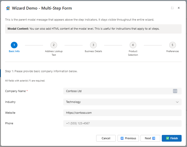
Wizard Modal |
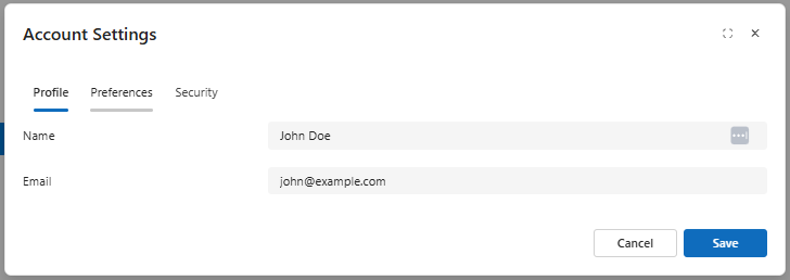
Tabbed Modal |
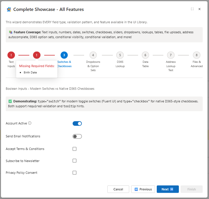
Step Validation |
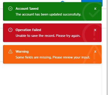
Toast Notifications |
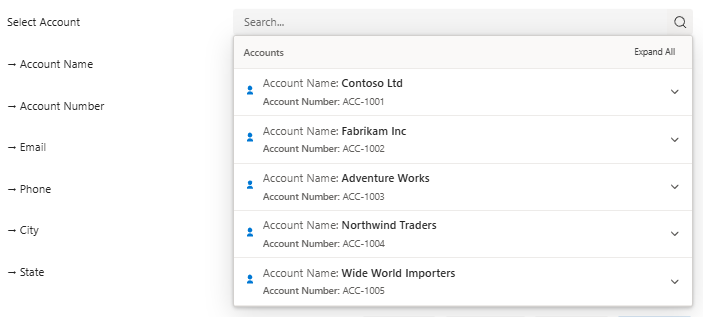
Inline Lookup |
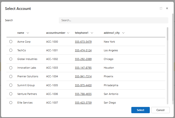
Lookup Modal |
MIT License - Free to use in your Dynamics 365 projects
Built with ❤️ for the Dynamics 365 community