
Replies: 1 comment

|
duplicate lock this |
0 replies
Sign up for free
to join this conversation on GitHub.
Already have an account?
Sign in to comment

Uh oh!
There was an error while loading. Please reload this page.
Uh oh!
There was an error while loading. Please reload this page.
The problem
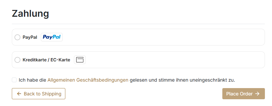
A problem I’d love to see solved is the current UI/UX of the payment method selection screen. At the moment, this area feels quite raw and unfinished compared to the rest of the interface.
The payment method selection is an important part of the user journey, so it should feel clear, polished, and easy to use. Right now, users may have difficulty quickly understanding available options or feeling confident during this step.
Before:

The solution
A solution that would help is improving the visual design and usability of the payment method selection section.
Possible improvements could include:
I have already made a few small UI adjustments that show one possible direction for improvement.
After:
Additional context
The goal is not necessarily to redesign the entire checkout flow, but to make the payment method selection feel more refined, intuitive, and production-ready.
Do you plan to work on this subject?
All reactions