移动端 Safari 浏览器 100vh 的问题与解决方案 #30
Description
问题背景
假设有一页面布局如下:
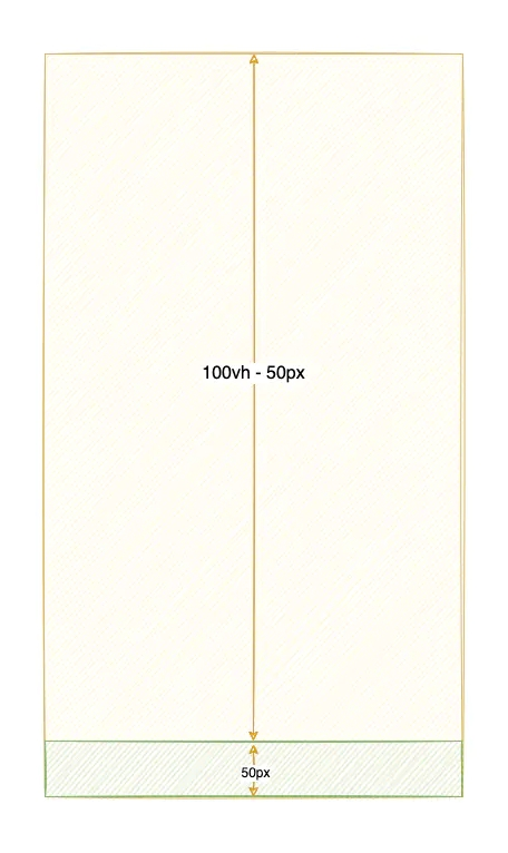
下方 50px 悬浮于底部,采用 fixed 布局,示例如下:
<div class="container">
  <!-- height: 100vh - 50px -->
  <div class="page"></div>
  <!-- fixed bottom, height: 50px -->
  <div class="tabbar">TabBar</div>
</div>
<script>
  window.onload = function () {
    const arr = new Array(100).fill(0).map((_, index) => index + 1)
    const pageEl = document.querySelector('.page')
    const listEl = document.createElement('div')

    arr.forEach(item => {
      const itemElement = document.createElement('div')
      itemElement.innerText = item
      itemElement.className = 'list'
      listEl.appendChild(itemElement)
    })

    pageEl.appendChild(listEl)
  }
</script>
当你使用 iPhone 的 Safari 浏览器打开此页面时,就会出现如下情况:
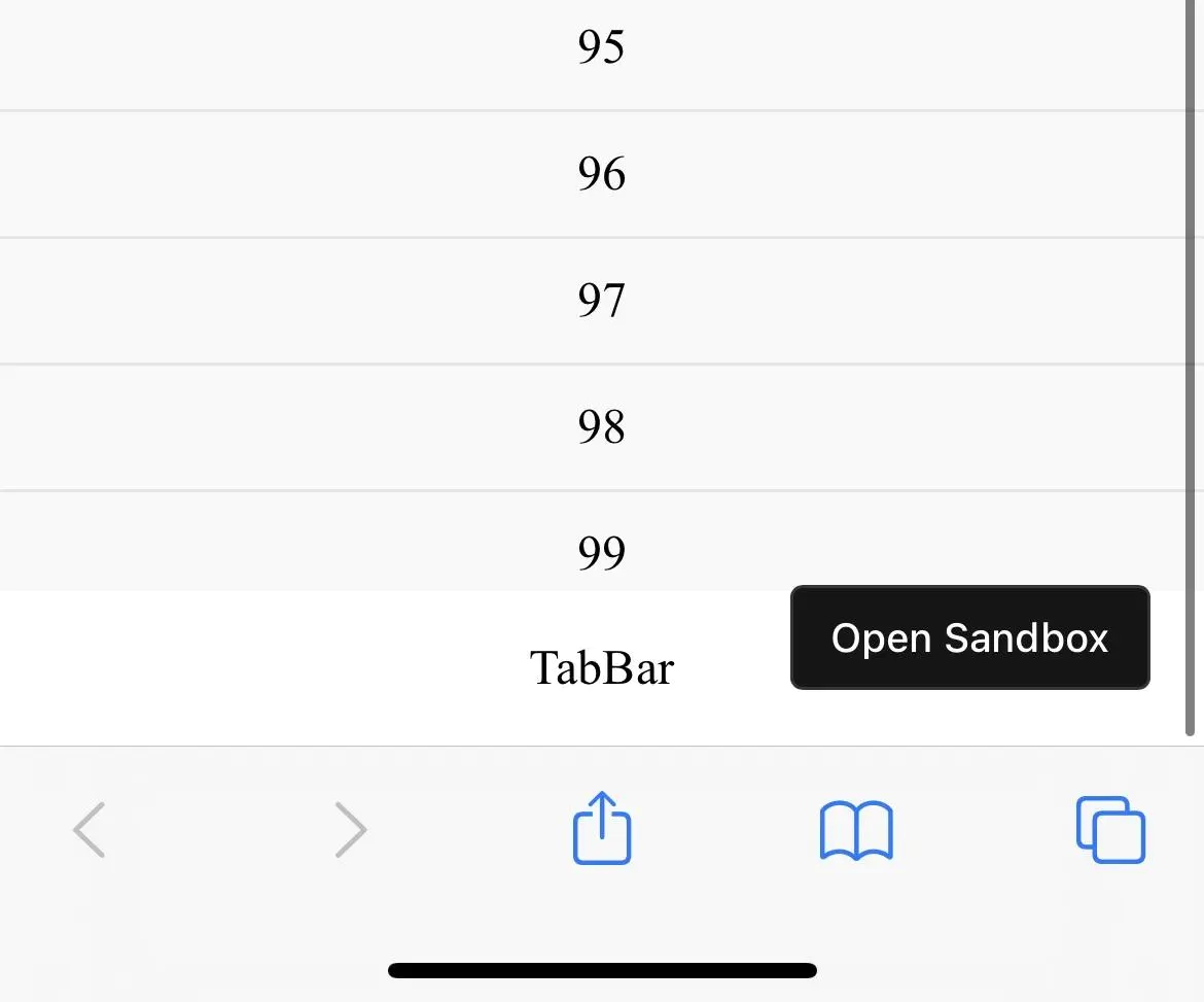
截图中已滑动至页面最底部,然而 100 被 TabBar 部分挡住了(其他浏览器均能正常展示出来)。
原因
我们知道,vh、vw 都是 CSS 中的一种相对长度单位,1vh 表示 viewport 高度的 1%(vm 同理)。简单来讲,viewport 基本上是指当前文档的可见部分,因此 100vh 表示可见文档的最大高度。
可事实真是如此吗?
在 Safari 浏览器中,100vh 如下图所示(出自):
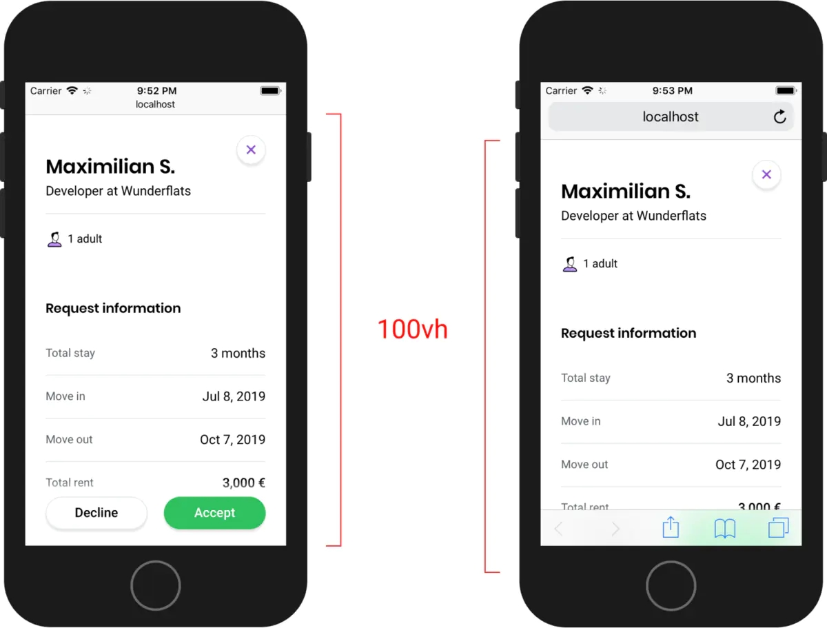
按上面所说,100vh 不应该是 viewport 可视区域的全部高度,为什么右图的高度会超出的呢?
做个简图区分一下吧:
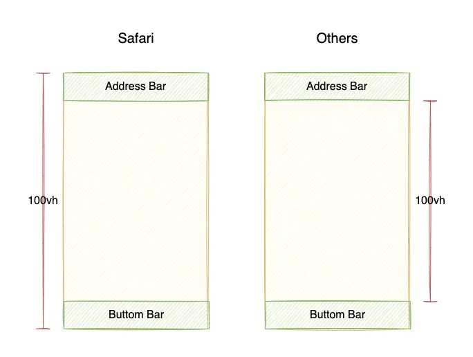
所以,这就是为什么在 Safari 会被挡住一部分的原因。
官方解释
是 bug 还是故意为之?
可以详细地看下这篇文章:Viewport height is taller than the visible part of the document in some mobile browsers,然后文章作者给 WebKit 提了个 bug,其中 Apple 工程师 Benjamin Poulain 的回答如下:
This is completely intentional. It took quite a bit of work on our part to achieve this effect. :) So, it's a feature, not a bug.
然而,并不是只有 Safari 是这样做的,比如 iOS 端 Chrome 浏览器表现与 iOS 端 Safari 一致
解决方法
尽管这并不是大多数开发者想要的,但很无奈,我们只能想办法去「修复」它,使得我们的网站在各浏览器表现一致。
方案一:使用 -webkit-fill-available
简单来说,-webkit-fill-available 就是自动填满剩余空间(详见)。这里使用另一个示例,来说明 -webkit-fill-available 的一些问题,如下:
<!DOCTYPE html>
<html>
<head>
<meta charset="UTF-8" />
<meta http-equiv="X-UA-Compatible" content="IE=edge" />
<meta name="viewport" content="width=device-width, initial-scale=1.0" />
<title>Document</title>
</head>
<style>
* {
padding: 0;
margin: 0;
text-align: center;
}
body {
min-height: 100vh;
display: flex;
flex-direction: column;
}
</style>
<body>
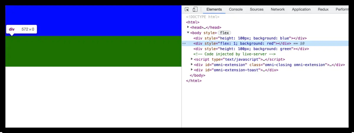
<div style="height: 100px; background: blue"></div>
<div style="flex: 1; background: red"></div>
<div style="height: 100px; background: green"></div>
</body>
</html>以上示例,分别会有蓝、红、绿三部分,按预期结果,它们应该会占满整个可视区域(完整示例请看 CodeSandbox),而 Safari 中底部绿色部分会被挡住。然后我们添加在 body 添加上 -webkit-fill-available 看看:
body {
  min-height: 100vh;
  min-height: -webkit-fill-available;
  display: flex;
  flex-direction: column;
}
iOS 上的 Safari 中的表现是正常了,但是你会发现 Chrome 下红色区域没了,原因是 Chrome 84 起已不再支持 -webkit-fill-available,所以实际渲染如下:
那么解决方法就是,针对 Safari 浏览器才设置 -webkit-fill-available 即可,这里利用到 @support 和 -webkit-touch-callout,如下:
body {
  min-height: 100vh;
  display: flex;
  flex-direction: column;
}

@supports (-webkit-touch-callout: none) {
  body {
    min-height: -webkit-fill-available;
  }
}
这样就 OK 了,Safari 和 Chrome 表现均如预期一致。这也是 postcss-100vh-fix 插件的解决方案。
然而,以上方案并不适用于这些情况,比如:height: 90vh、height: calc(100vh - 50px),因此才有了方案二。
方案二:通过 CSS 变量计算 1vh 所表示的实际高度
思路:
设置一个 CSS 变量(比如 --vh),然后通过 JavaScript 脚本动态设置 --vh 的值,然后使用时需兼容处理即可(比如,height: 100vh; height: calc(var(--vh) * 100))。
实现如下:
<style>
  :root {
    --vh: 1vh;
  }
</style>

<script>
  !(function (n, e) {
    function setViewHeight() {
      var windowVH = e.innerHeight / 100
      n.documentElement.style.setProperty('--vh', windowVH + 'px')
    }
    var i = 'orientationchange' in window ? 'orientationchange' : 'resize'
    n.addEventListener('DOMContentLoaded', setViewHeight)
    e.addEventListener(i, setViewHeight)
  })(document, window)
</script>
使用 vh 时,需要这样兼容处理:
.page {
  height: calc(100vh - 50px);
  height: calc(var(--vh) * 100 - 50px);
}
有一个 react-div-100vh 库就是获取 window.innerHeight,然后将其值设置为容器高度实现的,然而这也是仅可处理 100vh 的情况。
至于使用哪一种解决方案,视乎实际情况而定吧!
References
· Viewport height is taller than the visible part of the document in some mobile browsers
· How to fix vh(viewport unit) css in mobile Safari?
· 解決 safari mobile 上 css 數值 "vh" 的問題
· 100vh in Safari on iOS